This post is the latest installment in a longer saga about weaving bookmarks with naturally dyed 40/2 linen. The saga spans many months, if not years. I have posted about these bookmarks in the past. You can read my most recent post about it here.
Or you can just catch up on the back story in this post!
My linen bookmarks are woven with 40/2 linen. They are not too time-consuming to produce, though the pricing still works out to a meager hourly rate when I take into account all the steps involved in the dyeing plus the weaving.
On the other hand, since I love dyeing more than almost anything (except possibly growing the dye plants), I never really account for that part of the process when I think about pricing. I am so compelled to dye that I dye yarn even when I have no specific outcome or product in mind.
My bookmarks are a lower-price-point item than my currently non-existent books or my rya wall hangings, so they sell pretty consistently at the Shelburne Arts Co-op. I make some additional direct sales to co-workers and friends. Thanks to the fantastic invention of reading glasses, I can now hemstitch with increased efficiency. So, as a sweet little item for sale, it’s mostly good.
Here’s the bookmark back story. In January of 2014 I decided to weave a new batch of bookmarks with a darker shade of madder-dyed pink. Normally I use a very light shade of pink. But, I’d made some lovely darker pinks and wanted to use them. I made a few huck lace heart motif bookmarks from this warp, but I wasn’t entirely satisfied with them, so I didn’t weave off the warp for literally months.
There were two problems. First, the gauge of yarn seemed slightly more coarse than the 40/2 linen yarns I’d bought in the past from the same retailer. Just slightly, but enough to make a difference. I’ve had some discussions about this with another weaver who uses the same yarn, and with one of the folks at the store where I buy my yarn. They do not agree with me. So, maybe it was something else and not the size of the yarn. Whatever it was, I could not get the same number of picks per inch (threads in the weft) as I had in the past, and the heart motifs were all slightly elongated. I wasn’t pleased.
Second, the darker color did not work as nicely with the lace weave structure, in my opinion, as the lighter shades of pink. I have read that lace works best with light colored yarns. The structure involves horizontal and vertical lines (floats) which need to be viewed in a certain way in order for the design to be distinct. Light must bounce off of the yarn in order for the motifs to be clearly seen by the viewer. The more reflectivity (i.e., the lighter the color of yarn) the better the motifs will show. So, the combination of less reflectivity and less compact threads made the whole design less successful, in my opinion.
Due to life circumstances, for months I did not have the mental energy to tackle the relatively simple task of re-designing a new pattern for the number of ends in my warp and rethreading the warp (only 75 ends).
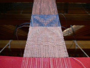
In September I was finally motivated to get the warp off the loom. First I tried a heart motif from Twill Thrills (scroll to the bottom of the page). The draft was designed to be woven with sewing thread. 40/2 linen is much thicker. So, it didn’t work at all. Pretty ugly.
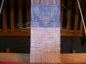
Yes, the first heart (closer to the viewer) is upside down. No, you can’t see it at all. I reversed the treadling and tried with a darker weft color. Also ugly. Why not just start fresh? I was trying to use up the warp. Naturally dyed with madder, don’tcha know.
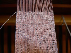
So, I re-threaded once again. This new pattern was much more satisfactory. The dark pink warp and extremely pale pink weft worked very nicely together. However, I couldn’t manage to beat it evenly. I wove three little bookmarks of various lengths and imperfect quality, and that was the end of the warp.
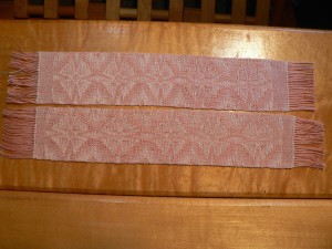
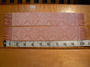
Now I have washed and ironed a couple of the bookmarks with the four-petaled flower-like motif above. They have a nice drape. Actually they are pretty cute.
You can see that the third motif from the left is short in both bookmarks. Matthew thinks they look like bacon. “You can see that the bacon is 11 inches long,” says he.
I think the lesson learned from this experiment is that I need to adjust the design so that the motifs are taller. And obviously be more careful with my beat.

