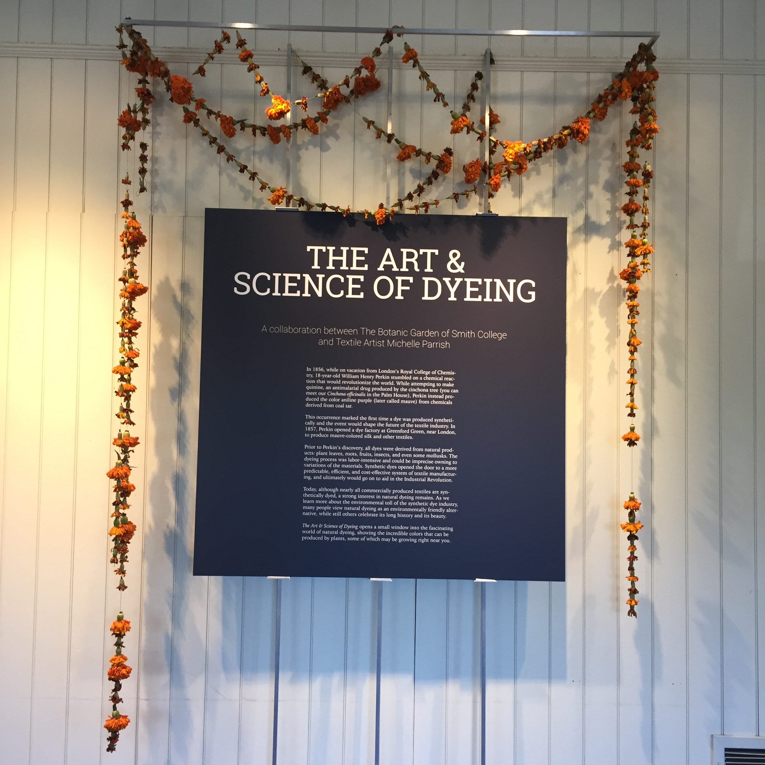
The show is up at Smith and it is gorgeous! Actually, the show opened way back in September. It will be up until May, so you still have time to go see it. Here’s the sign that greets you as you walk in. It makes me feel famous!
The whole concept of the exhibit was the vision of Sarah Loomis, Manager of Education at the Botanic Garden. I am so grateful to have been a part of creating it. It’s incredibly satisfying to stand in the gallery and see how it all came together.
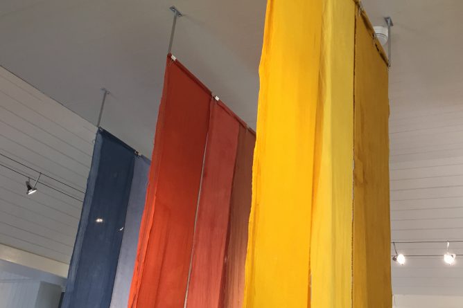
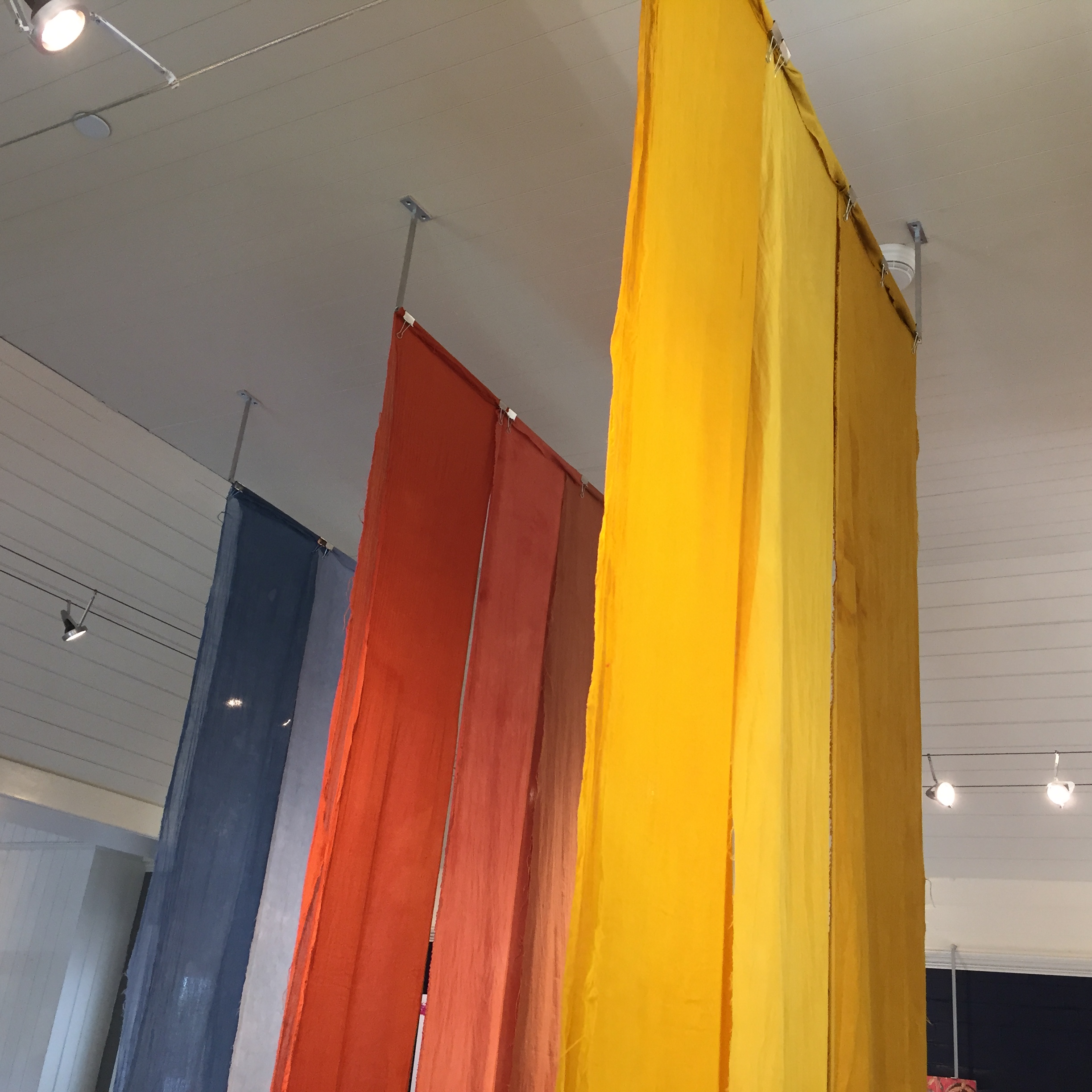
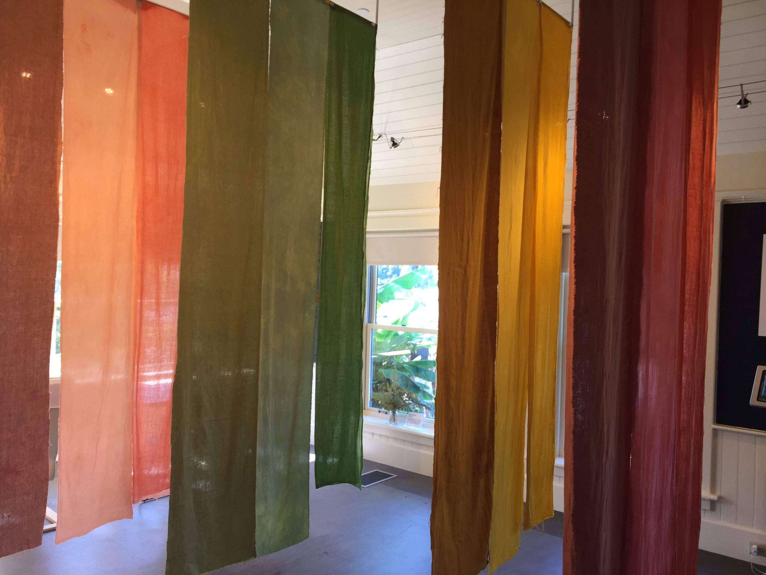
The first sequence of panels that you see as you enter the gallery space is the primary color sequence of blue, red, and yellow. The blues are from woad, the reds are from madder, and the yellows are from marigolds.
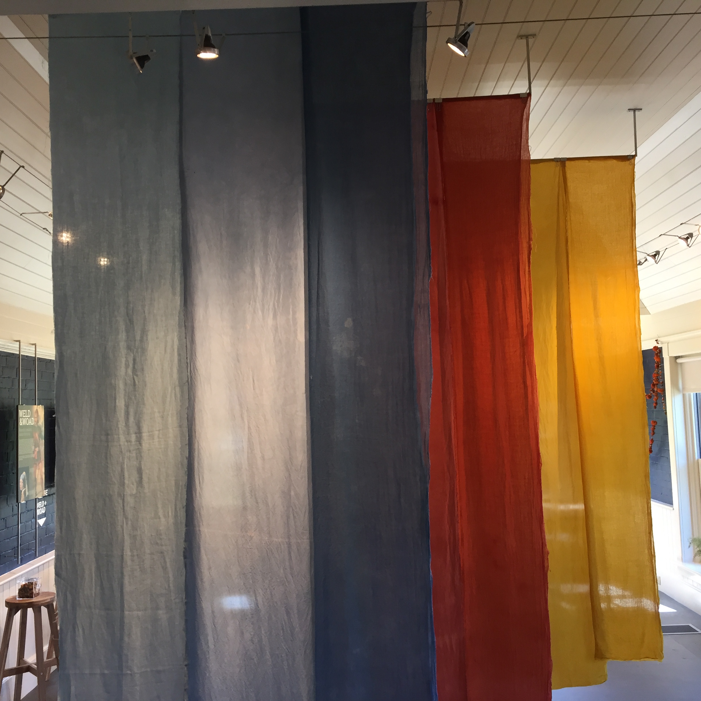
For each color I dyed three different fibers: linen, silk, and wool. In the photo above, the linen is on the left, silk is in the middle, and wool is on the right. Each panel is 9 feet long (or tall) and 16 inches wide. The wool gauze was very sheer, so those panels are doubled. I really love the color saturation of the two layers of cloth.
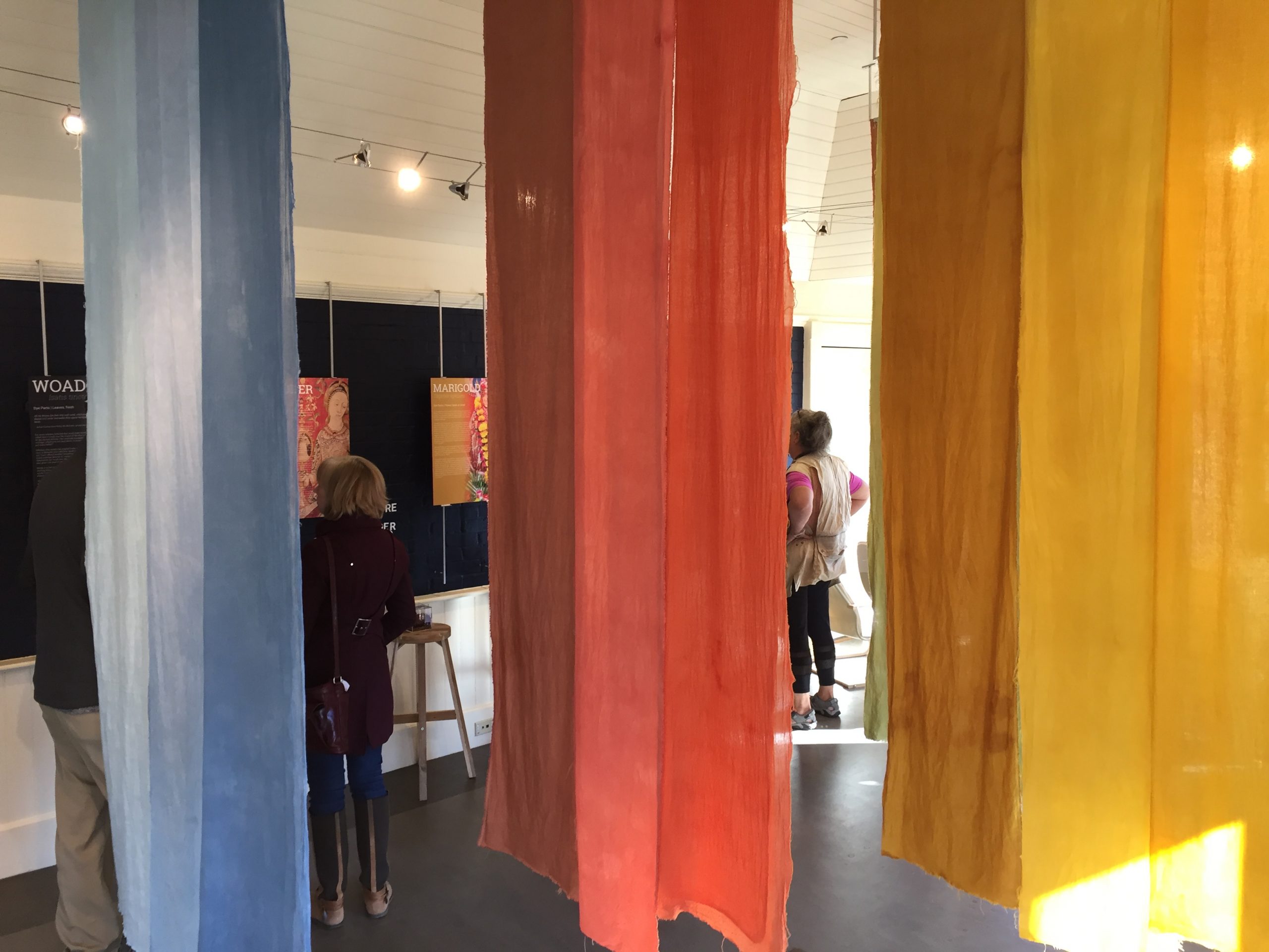
Depending on the lighting and the angle, the colors look different. Looking at it from the other direction (below) the wool is on the left, silk in the middle, and linen on the right.
It’s really fun to see how people are interacting with the cloth and the space. A sign at the entrance invites visitors to touch the cloth. And people do!


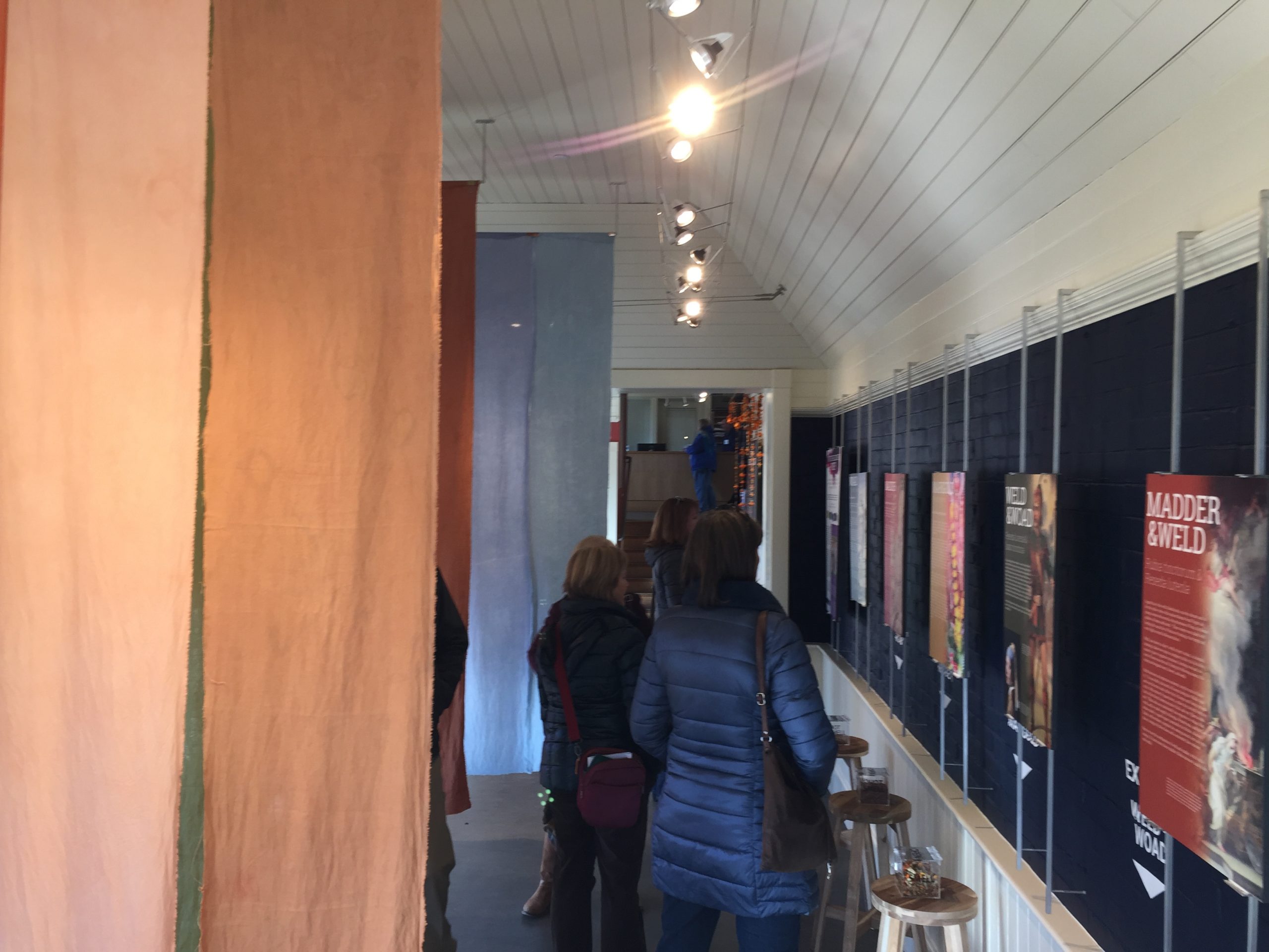
The long panels create a delightfully immersive experience.
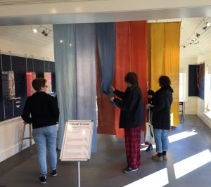
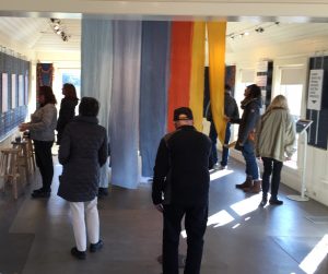
There is space to move between the panels so you can be surrounded by color.
The interpretive panels are beautiful and informative, explaining further about the historical uses of each plant:
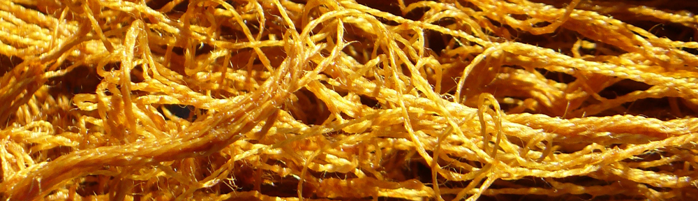
The interactive components are engaging and fun. My favorite are the clear boxes full of dried dye plant materials that you can open up and smell. Stinky weld, sea-weedy woad, fruity madder, mmm! You can see the boxes on the stools in the photo above.
There’s also an interactive screen with a slideshow about the steps in dyeing with woad. It’s a thrill to see that people take the time to look through it!

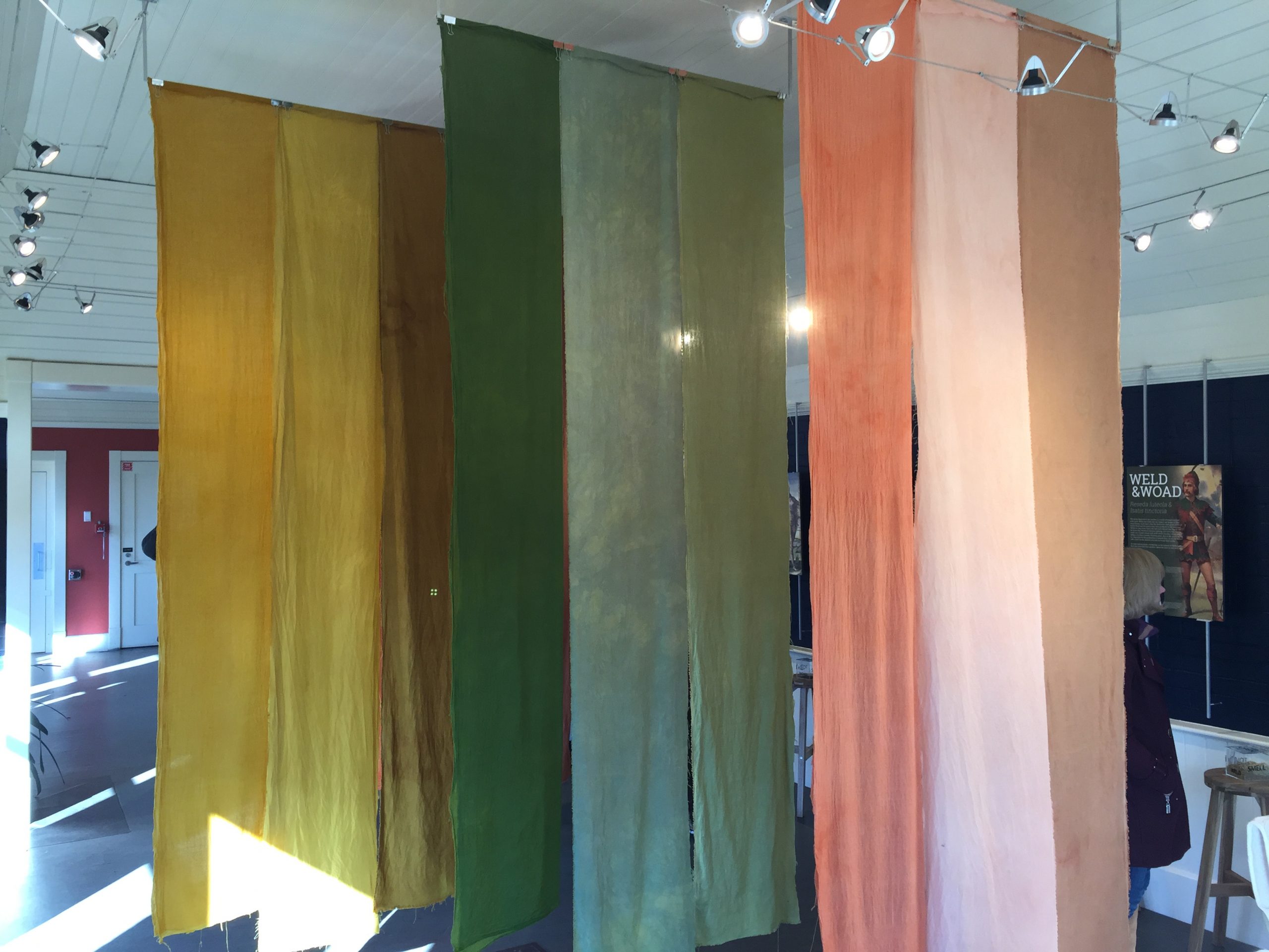
On the other end of the gallery are the orange and green panels. Honestly, they are more pink and peach than orange, but I still think they look lovely. The “orange” shades are from weld and madder together in the same dyebath. The greens are from woad overdyed with weld.
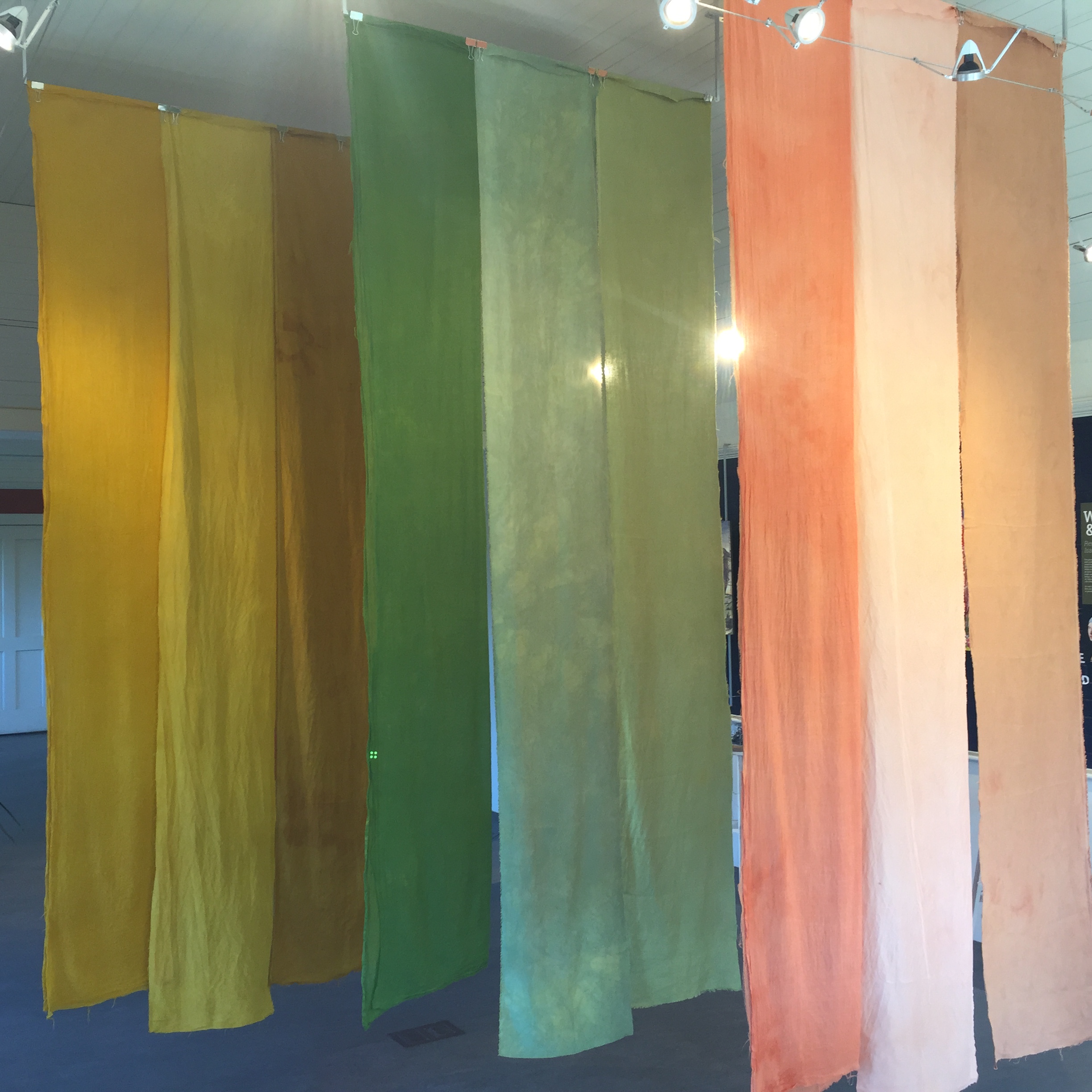
Again, depending on the angle and the lighting, the colors look different.
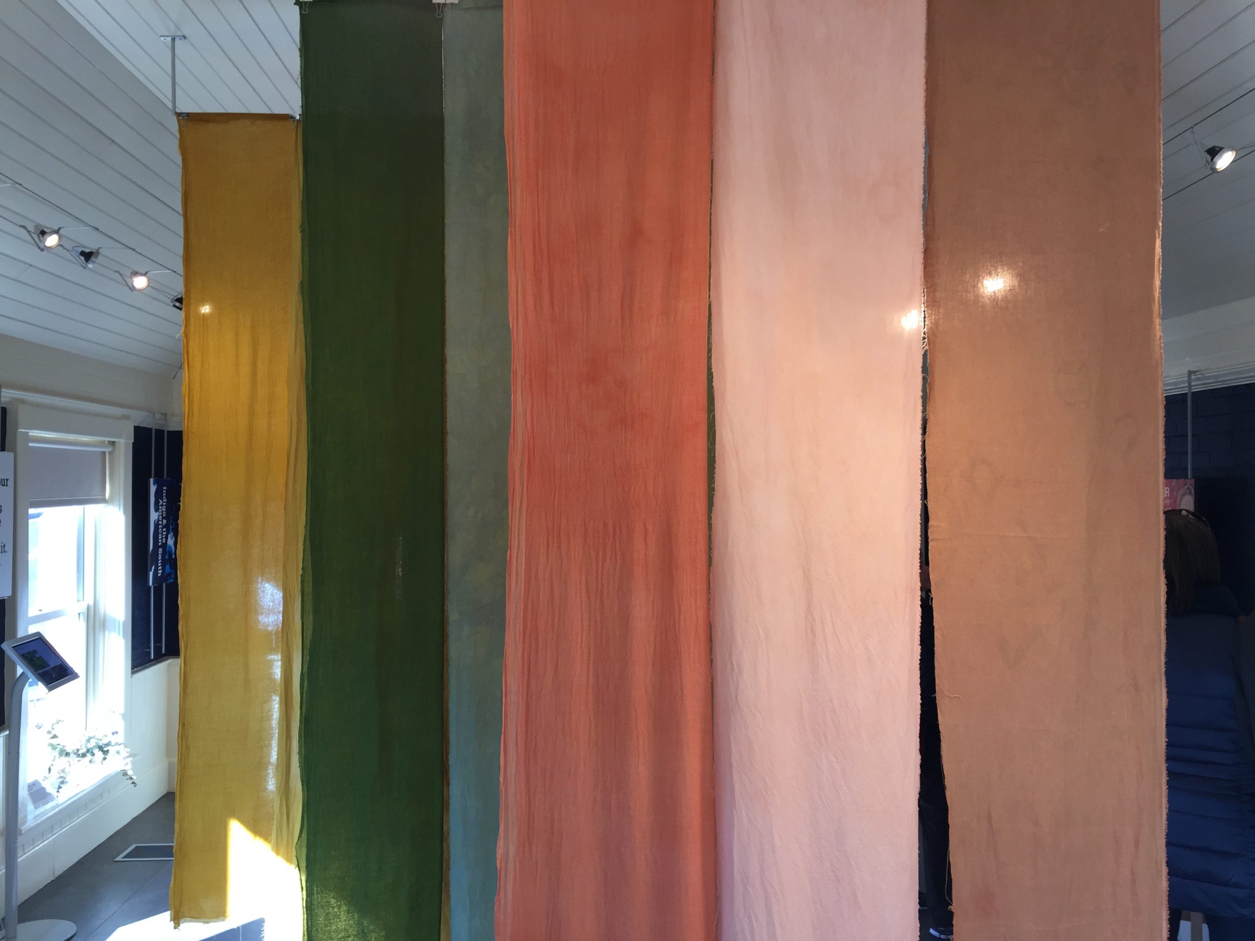
Not only does each fiber take up the dye differently, they each have a different texture, too. It’s just so rich and luscious!