Way back in 2020 I got some lovely, lustrous Romney fleece from the Richardsons in Phillipston, MA. Yes, that 2020.
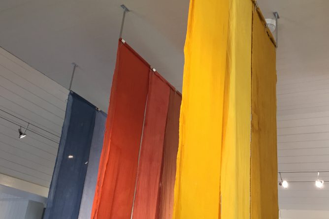
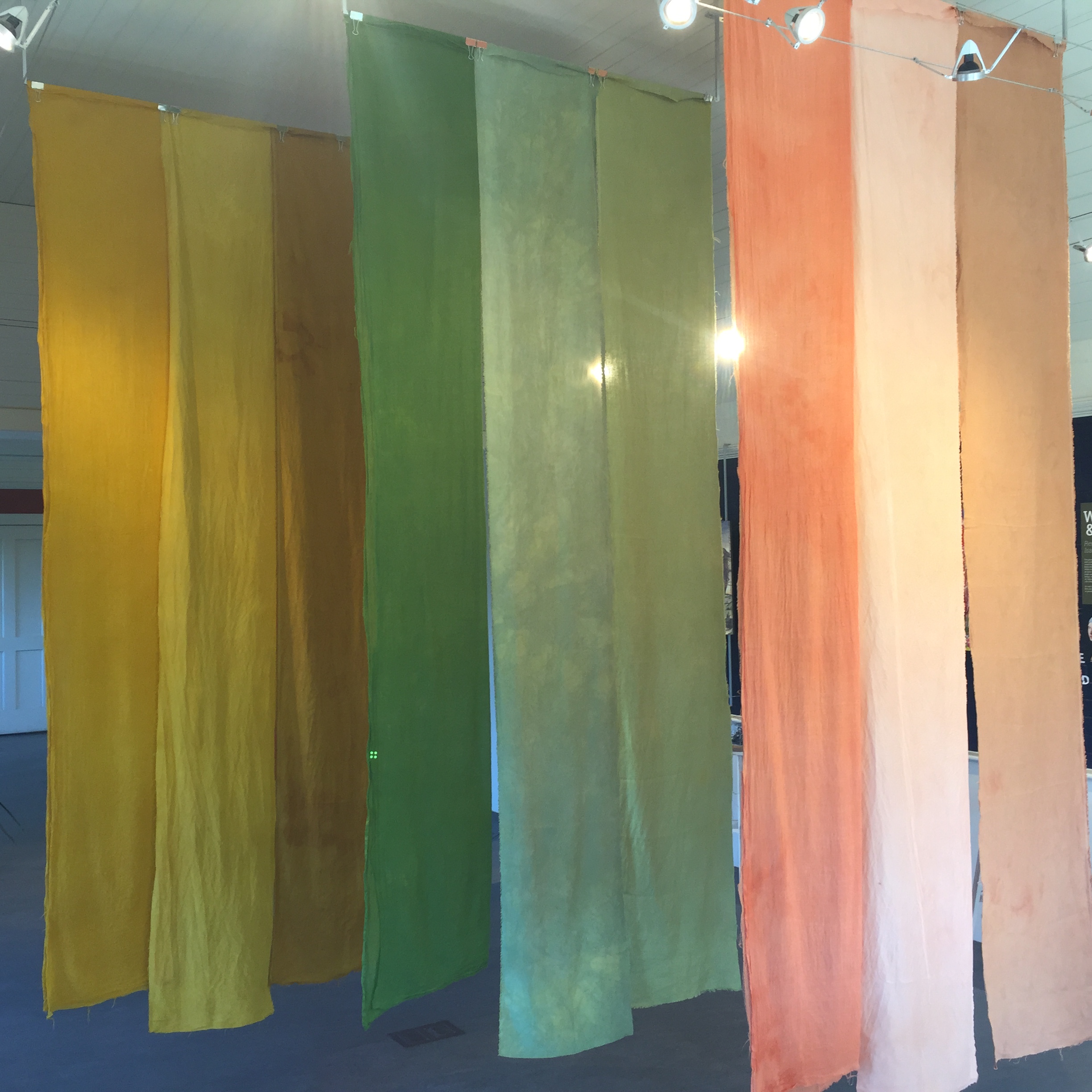
I dyed a lot of it blue with woad.
When I post photos of my dyeing results, sometimes people ask me, “What are you going to do with it?” I’m tempted to say, “Do? What do you mean? It’s done!” Making color is fun and satisfying all by itself. But, yes, I do aspire to spin yarn and ultimately weave cloth with it. This blog post is about some yarn that I have spun!
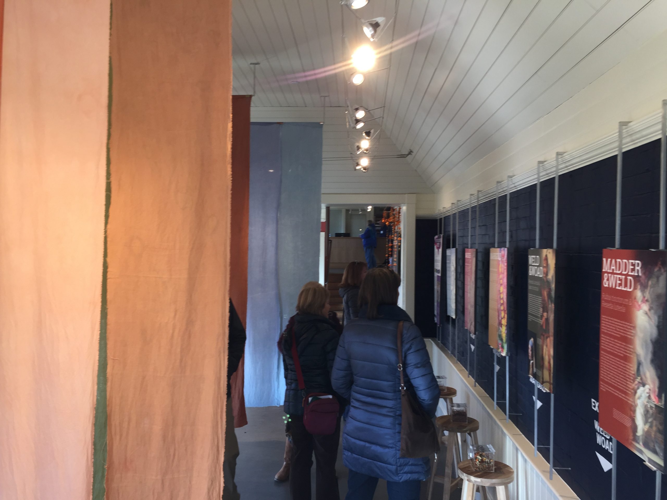
Over the years I have posted many images of woad vats on this blog. So I will skip the dyeing process in this post, and stick to the yarn production process. Here’s how it happened:
In 2021 I got a picture in my mind of a yarn that combined various shades of woad blue and black alpaca. I was inspired by some lovely silvery gray yarn from New York Textile Lab which is 50% Romney 50% alpaca. It’s a luxurious yarn that embodies the best of both fibers. I, too, was hoping to combine the sheen and lustre of Romney with the softness and silkiness of alpaca.
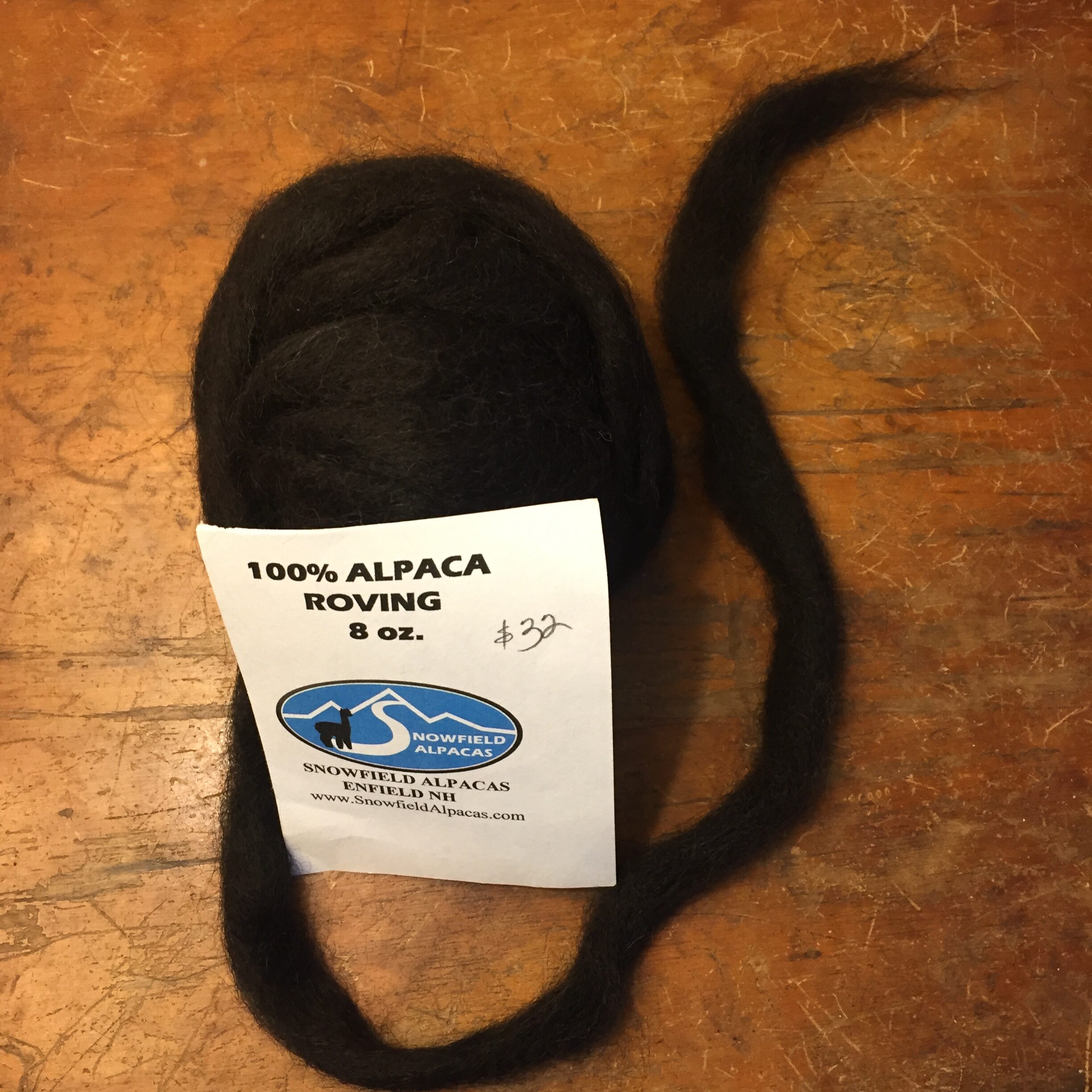
The black alpaca roving is from Snowfield Alpacas in New Hampshire, purchased at the Fiber Festival of New England. When? A long time ago. We don’t know how long.
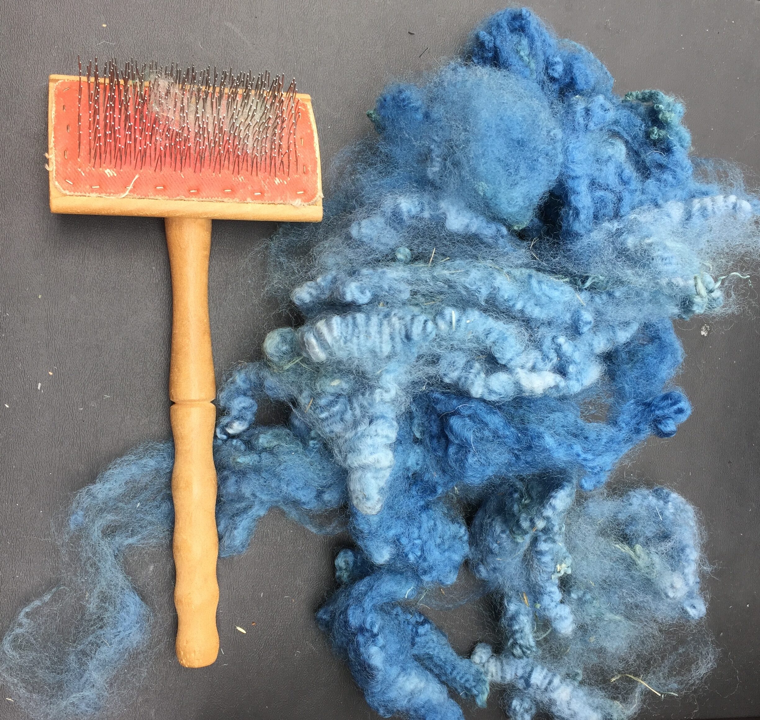
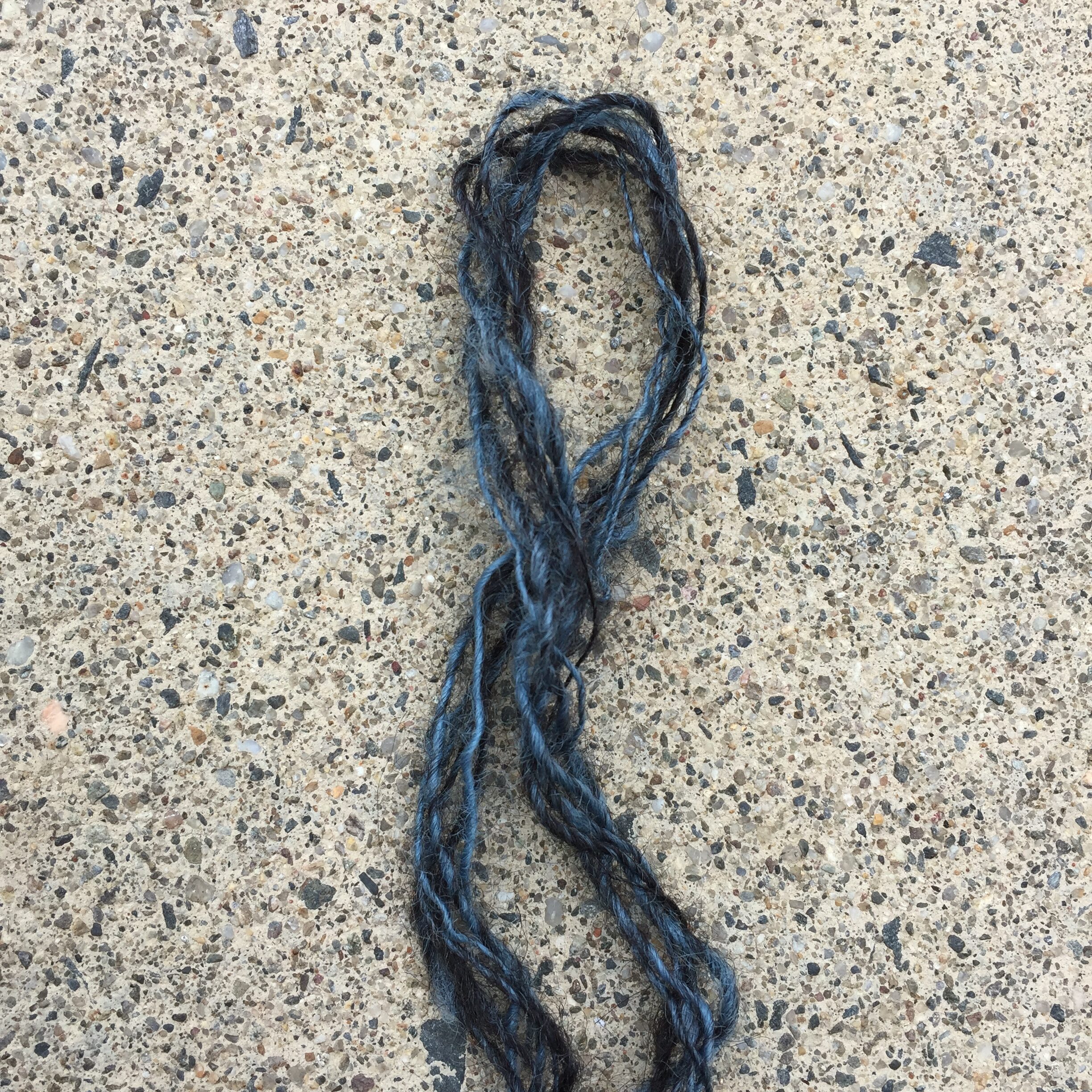
I spun a teensy sample with a drop spindle to see what it might look like, and I loved it:
I wanted to make a significant amount of yarn so I could weave enough yardage to sew into “something.” That’s as far as I’ve gotten with my vision of the finished product. I know a lot of people spin with a specific project in mind, but welcome to my process.
I weighed out one pound of woad-blue locks, thinking at first that my blend would be 50/50 and I would end up with 2lbs. prepared fiber.
I flick carded the locks to remove any remaining vegetable matter (though the fleeces were really clean to begin with) and to combine various shades of blue. Here are a few locks lined up and ready to flick:
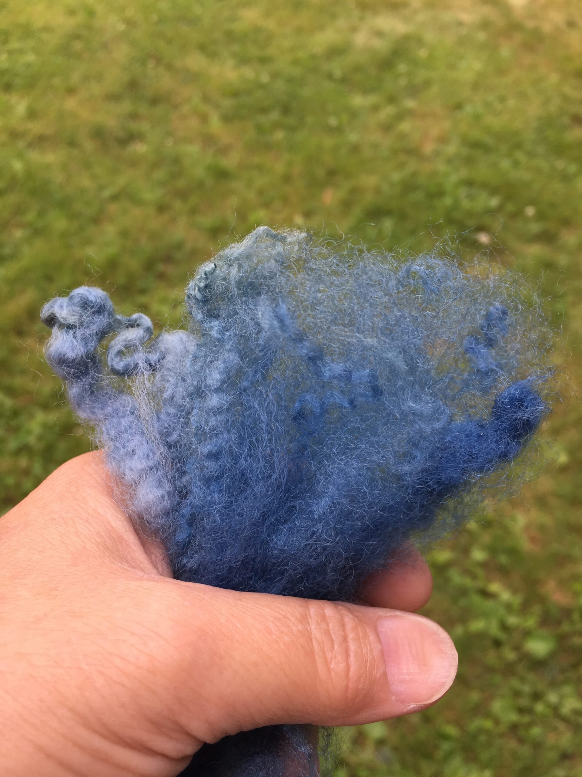
Here’s the little bundle all fluffed up:

And here’s one with lighter shades of blue:
What are those white areas? When I dye locks in a woad vat, sometimes the dye doesn’t penetrate all the way through the lock. This is especially true near the cut-end of the locks where it’s denser. It’s even more true when I’m exhausting the vat and the locks are slurping up the last bits of color.
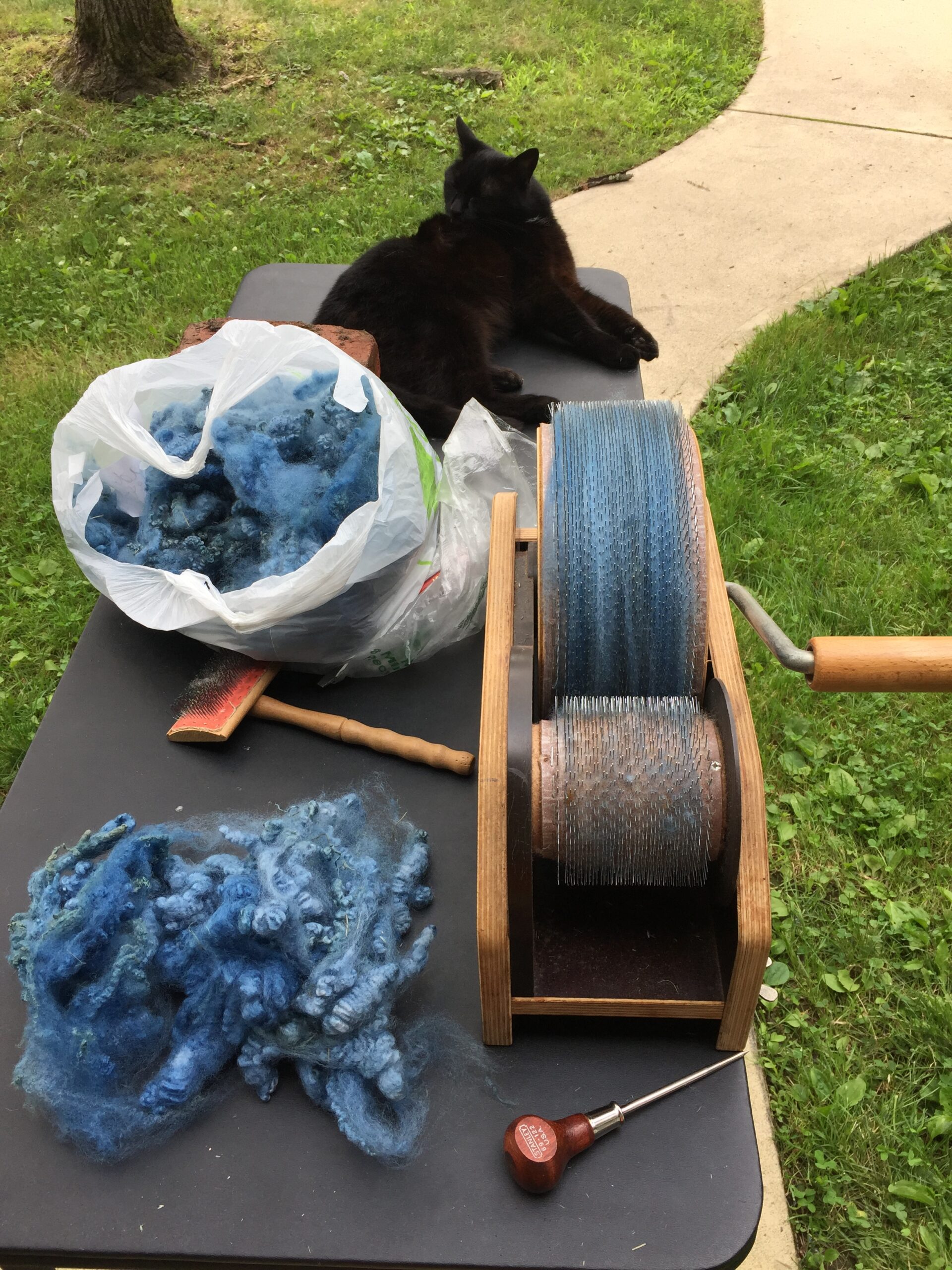
Then I ran the locks through a drum carder to further blend the different shades of blue. Here’s the set up one fine day in July of 2021. Our cat Sammy has inspected everything. Having detected no danger, she’s relaxing and grooming.
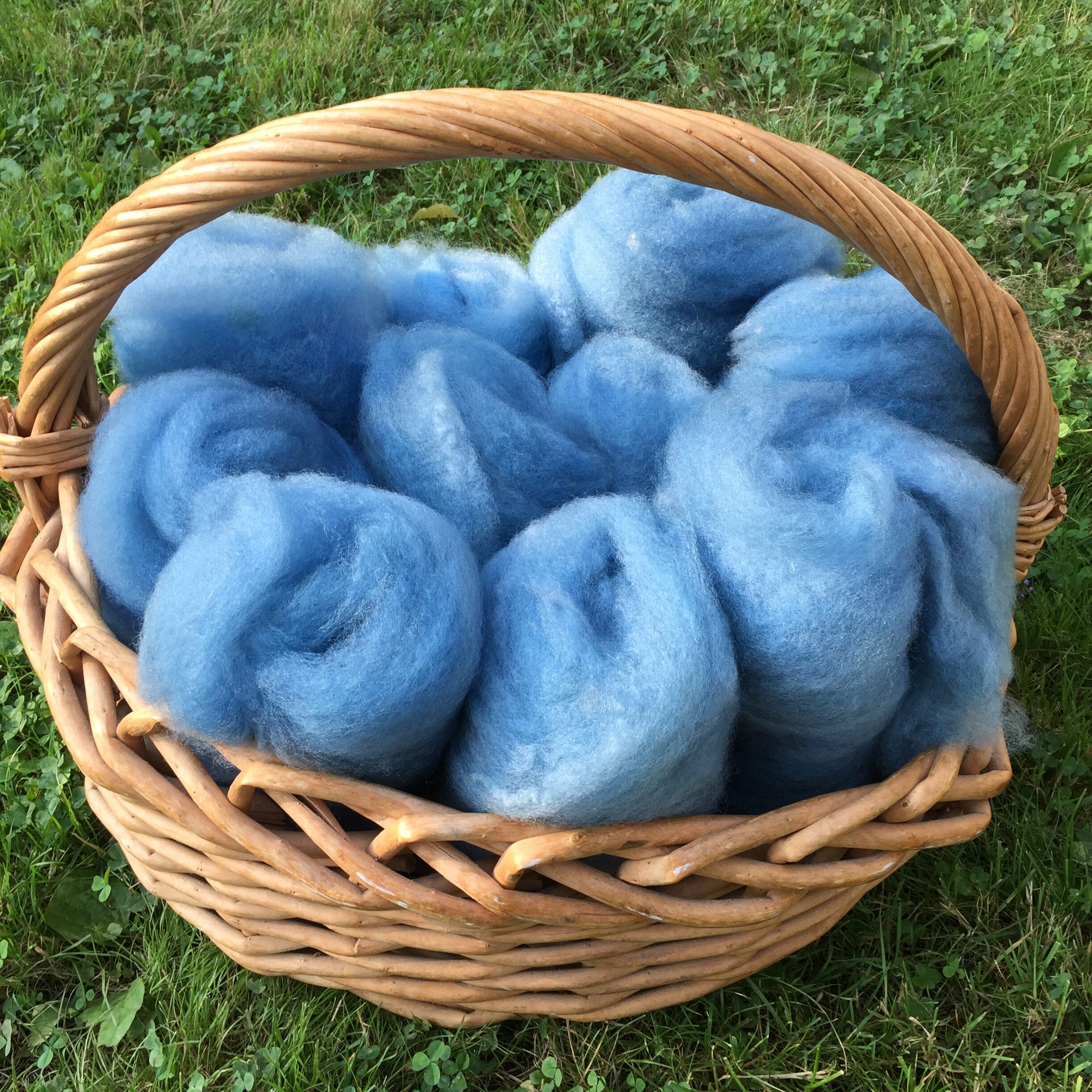
I gradually carded all the fleece into little batts.
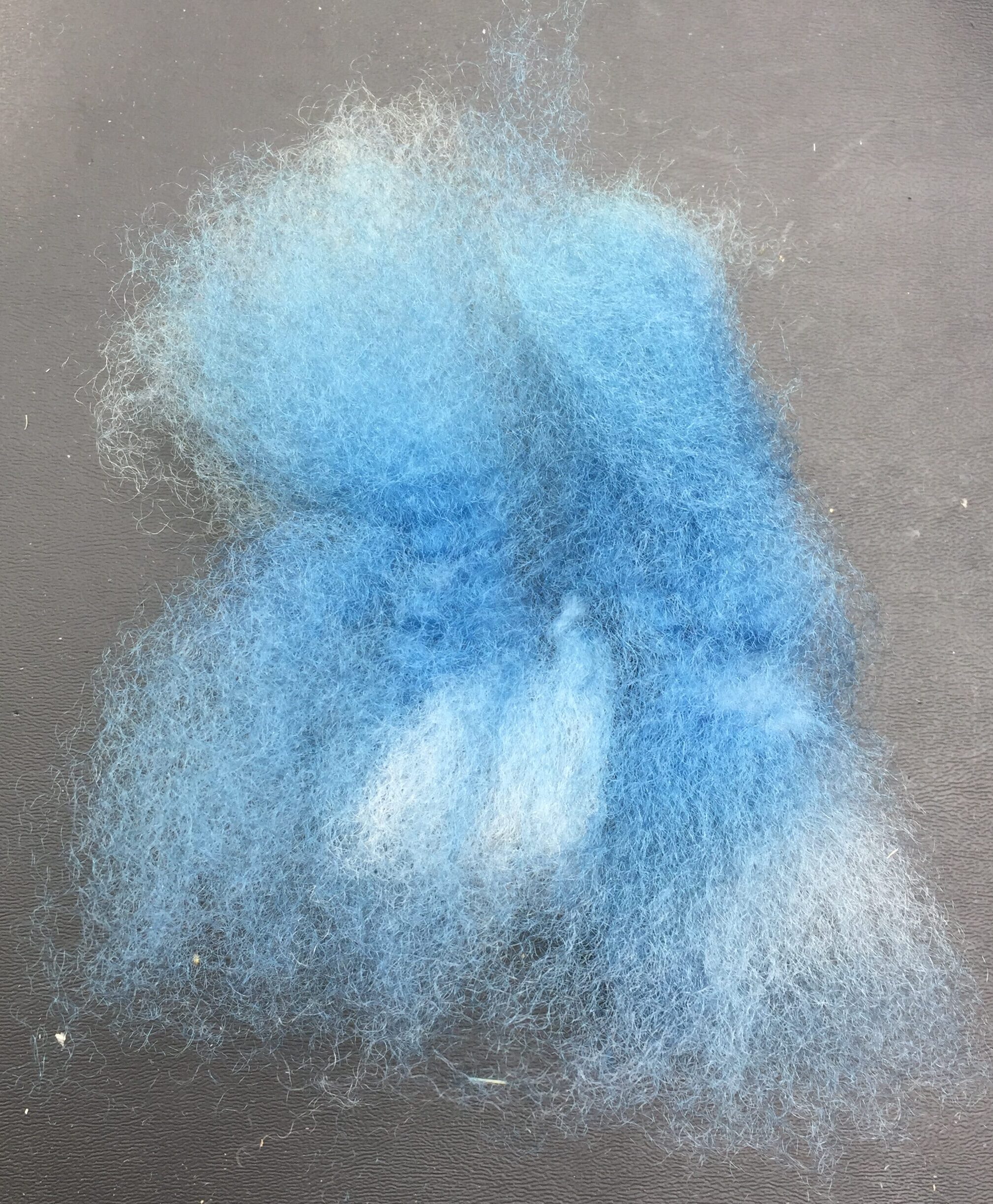
Here’s a basketful of batts. The blue in this image is a little more Smurfy than real life, but you get the idea:
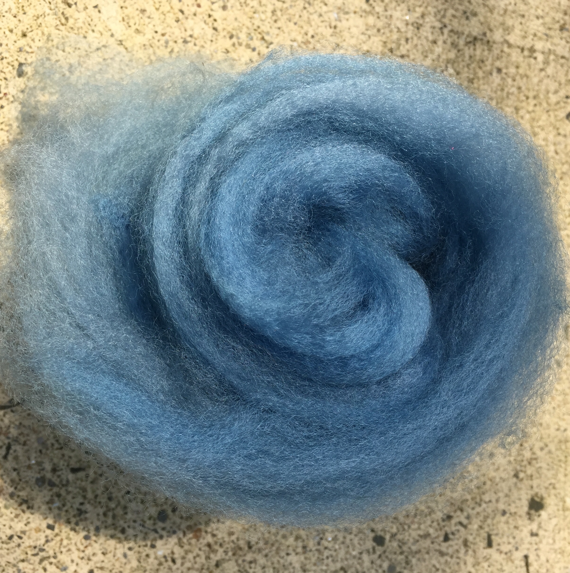
This image shows the sheen much better. You can also see that there’s a lot of color variation still, despite all the blending:

And here’s a view from the cute, curly end of a rolled up mini-batt:
I split the wool batts and carded them again with the black alpaca roving. I have a mini-carder, and each blended batt was about one ounce.
The first 50/50 blue-and-black batt was deep, dark, and dramatic, but I wanted more sparkle from the blue. So, I sampled some more and settled on a ratio of 70% wool and 30% alpaca. Which meant that I needed to card more wool get 2lbs blended fiber. Here’s the 70/30 blend:

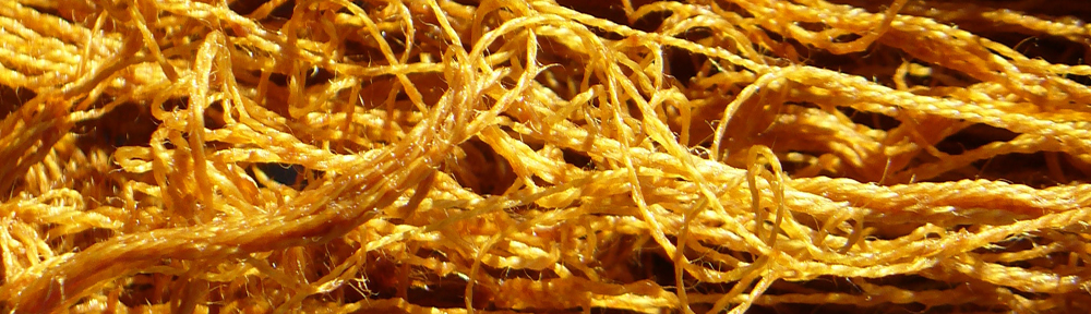
I really love the contrast of the black and bright blue in the spun yarn, as well as the more uniformly blended dark-blue areas:
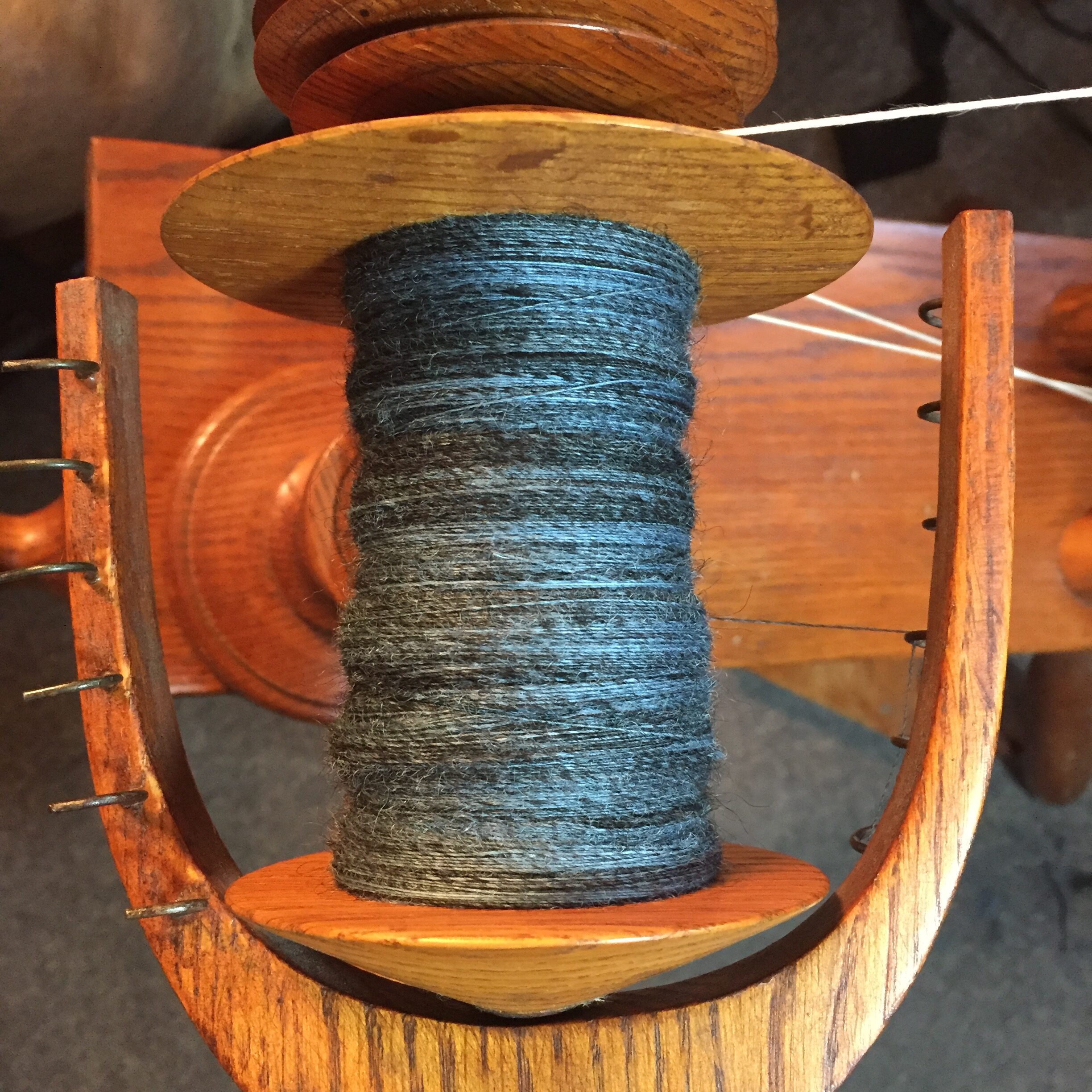
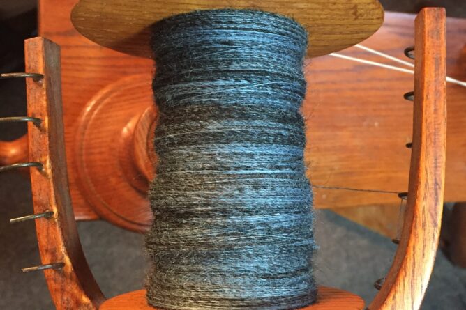
Because the alpaca and the wool are not consistently blended, I got worried about leaving the yarn as singles for weaving. The areas that are all-alpaca are fluffier and the staple length is much shorter. I worried about how the different textures would behave. So I plied it. My future self may or may not thank me, but what’s done is done. Here are the two skeins I’ve spun and plied thus far:
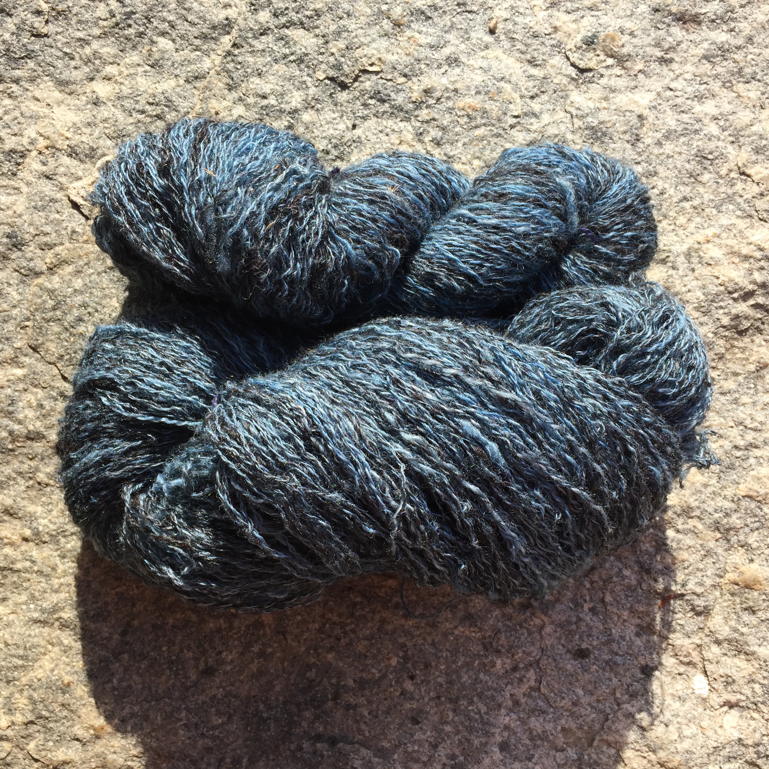
My present-day self is very happy. I absolutely love how it looks and feels. These two skeins together weigh about 8 oz. so I am about halfway through the fiber I prepared. Which is totally fine because it’s really fun to spin!