This afternoon I wove off the rest of the Hop Vine warp. I am pretty pleased with the cloth, and have even come around to liking the three sections that I was so critical of in my last post.
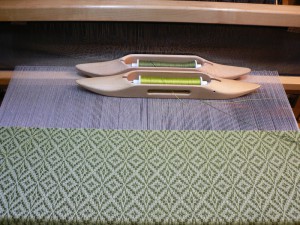
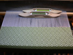
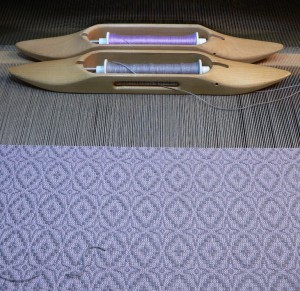
To add some variation to the pattern, I decided to switch to the “rose fashion” treadling for the remainder of the warp. You can see the difference in the two photos below. The first one shows the star fashion treadling. It is a series of diamonds with strong diagonals. The second is the same pattern and tabby colors woven rose fashion. Four-pointed stars alternate with ovals to create more undulation.
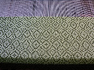
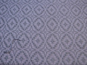
Here’s a close up of the cloth with the rose fashion treadling.
I do think it is more dynamic with the alternating motifs. That shift alone added a bit more energy to the cloth.
The other part of the question I was grappling with was whether anything could be done to make the natural, off-white background more rich and vibrant. I felt that my first three books, with natural warp and natural tabby, looked a little too sedate. A bit boring, in fact. I feared that even the star fashion cloth with the colored tabby was too quiet.
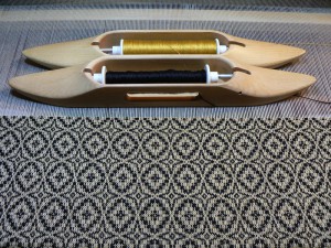
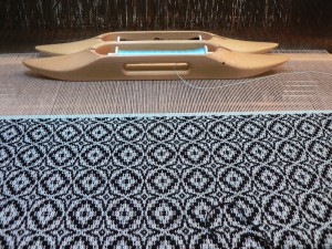
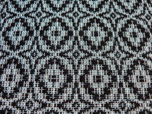
So, after I changed the treadling, the next thing I tried was to use black for the pattern weft, to create high contrast. But just black and white seemed too stark, so I decided to use a gold tabby weft (20/2 UKI “Antique”). Here’s the result:
I like it because the gold blends into the white well enough that it doesn’t create a jittery salt-and-pepper effect, but it is also distinctly gold (especially when viewed at a slight angle). So, the value of the color was close enough to the off-white to blend smoothy, but it still added richness to the background color.
This made me realize two things. One, the tabby color had to be close in value to the natural in order to work, which limited my color options (even though I recently stocked up on several pounds of the tragically discontinued UKI 20/2 cotton at Webs). Two, I had been ignoring one of the strongest attributes of white, which is its capacity for luminosity. What could I do to enhance the luminosity of the background?
After fumbling around with a few color combinations, I struck on 22/2 grey cottolin pattern weft with 20/2 Violet (UKI) tabby. The linen in the pattern weft added some sheen and the lightness of the purple glowed through.
Here’s a close up:
Based on this successful combination, I hypothesized that in order to maximize luminosity, the adjacent colors ought to be close in color as well as value.
But then I only had enough warp left for one more piece, and decided to go back to black for the last piece. So, the last piece is black 8/2 cotton-linen blend from Webs with Light Turk UKI 20/2 cotton tabby. Which is both luminous and has high contrast. There goes that hypothesis.

