Purple Cloth

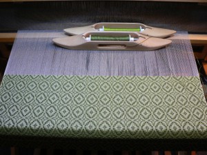
I wove some cloth! This shouldn’t be so remarkable, I suppose, but I’ve been really unproductive in the fiber art realm lately so it’s big news. Ultimately I plan to use this cloth to make a new batch of books with purple covers. I had hoped to have a few made in time for the upcoming “Purple Show” at the Shelburne Arts Co-op, but alas they will not be ready in time. I may get them finished before the end of the show…. The show hangs this Tuesday March 31st, and is up until Monday April 27.

Here are the weaverly details about this project: The warp is 20/2 cotton, from the discontinued UKI line. (12/27/2023 Edited: The UKI link is no longer useful if you’re looking for weaving yarns, but I left it anyway.) The color is called Malay Purple. There are 598 ends in the warp. The sett is 30 ends per inch. The width in the reed is 20 inches. My draw-in (how much the edges pulled in as I wove) was about 6% and the shrinkage in the width was about 4%. Shrinkage in length was about 6%. I washed it by hand in hot water and hung to dry.

The pattern is a miniature overshot motif called Maltese Cross. I’ve written about overshot in earlier posts, but I’ll quickly recap here. To weave overshot, you typically weave one pick of fine yarn (the same size as the warp) alternating with one pick of thicker yarn (approximately twice the diameter of the warp). The fine yarn makes a background that stabilizes the cloth creating a plain weave structure called tabby. In this piece of cloth, I used the same color of 20/2 cotton for the warp and the tabby. The thicker weft yarns float over several warp ends and form the pattern. I’ve woven most of my book cloth using overshot motifs. I really love them. To me they are simultaneously old-fashioned and psychedelic. Continue reading “Purple Cloth”

Hop Vine Color and Design

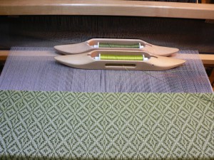
This afternoon I wove off the rest of the Hop Vine warp. I am pretty pleased with the cloth, and have even come around to liking the three sections that I was so critical of in my last post.

To add some variation to the pattern, I decided to switch to the “rose fashion” treadling for the remainder of the warp. You can see the difference in the two photos below. The first one shows the star fashion treadling. It is a series of diamonds with strong diagonals. The second is the same pattern and tabby colors woven rose fashion. Four-pointed stars alternate with ovals to create more undulation.

Mosstone and Pistachio Hop Vine Mosstone and Pistachio Hop Vine Rose Fashion

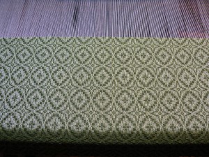
Here’s a close up of the cloth with the rose fashion treadling.

Mosstone and Pistachio close up

I do think it is more dynamic with the alternating motifs. That shift alone added a bit more energy to the cloth. Continue reading “Hop Vine Color and Design”

More Hop Vine and A Color Theory Question

Matthew pointed out that I have been spelling Hop Vine two ways: Hopvine as one word, and Hop Vine as two words. This is because I have seen it written both ways, and personally I don’t have a strong preference. Perhaps I should be more consistent, but I don’t have good criteria for choosing between the two spellings. Without good criteria, some decisions just can’t be made. INTP anyone?

Meanwhile, here are three more pieces that I’ve woven on this warp. I re-wrote the treadling to maintain a consistent tabby order, so the pattern looks a little different from my earlier woad- and madder-dyed pieces. All the yarns in this group are commercially dyed.

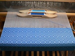
The one below has 10/2 tencel in Moroccan Blue for the pattern weft and 20/2 UKI cotton in Deep Turk for tabby:

blue pattern weft and blue tabby

You can see the actual color of the 20/2 yarn on the bobbin closest to the reed. You might be asking, “What happened to that bright blue?”  The background of the cloth looks very light because the warp is off-white. It mutes the tabby color. As I recall from a class on color theory for weavers with Susan Loring Wells, a color plus white is called a tint. Continue reading “More Hop Vine and A Color Theory Question”