I wove some cloth! This shouldn’t be so remarkable, I suppose, but I’ve been really unproductive in the fiber art realm lately so it’s big news. Ultimately I plan to use this cloth to make a new batch of books with purple covers. I had hoped to have a few made in time for the upcoming “Purple Show” at the Shelburne Arts Co-op, but alas they will not be ready in time. I may get them finished before the end of the show…. The show hangs this Tuesday March 31st, and is up until Monday April 27.
Here are the weaverly details about this project: The warp is 20/2 cotton, from the discontinued UKI line. (12/27/2023 Edited: The UKI link is no longer useful if you’re looking for weaving yarns, but I left it anyway.) The color is called Malay Purple. There are 598 ends in the warp. The sett is 30 ends per inch. The width in the reed is 20 inches. My draw-in (how much the edges pulled in as I wove) was about 6% and the shrinkage in the width was about 4%. Shrinkage in length was about 6%. I washed it by hand in hot water and hung to dry.
The pattern is a miniature overshot motif called Maltese Cross. I’ve written about overshot in earlier posts, but I’ll quickly recap here. To weave overshot, you typically weave one pick of fine yarn (the same size as the warp) alternating with one pick of thicker yarn (approximately twice the diameter of the warp). The fine yarn makes a background that stabilizes the cloth creating a plain weave structure called tabby. In this piece of cloth, I used the same color of 20/2 cotton for the warp and the tabby. The thicker weft yarns float over several warp ends and form the pattern. I’ve woven most of my book cloth using overshot motifs. I really love them. To me they are simultaneously old-fashioned and psychedelic.
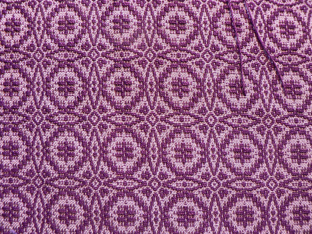
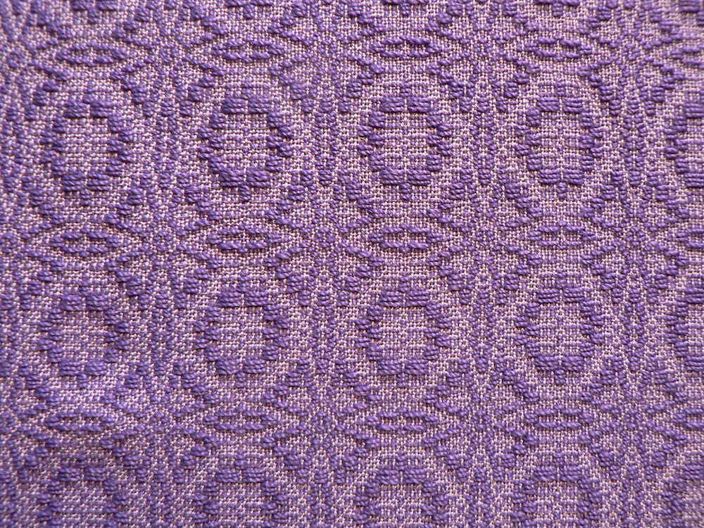
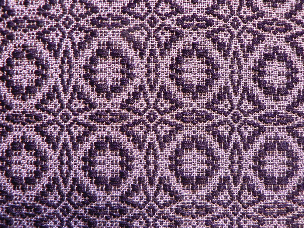
Here are some close-ups of the sections I’ve woven so far (there’s a lot more warp on the loom). In these images the cloth has been washed but not yet ironed. I wove the first section with 10/2 cotton for the pattern. I can’t tell you the name of the color because Webs (where I bought the yarn) doesn’t include this info on the label and I didn’t bother to make a note of it when I bought the yarn. Here’s the front of the cloth:
And here’s the back:
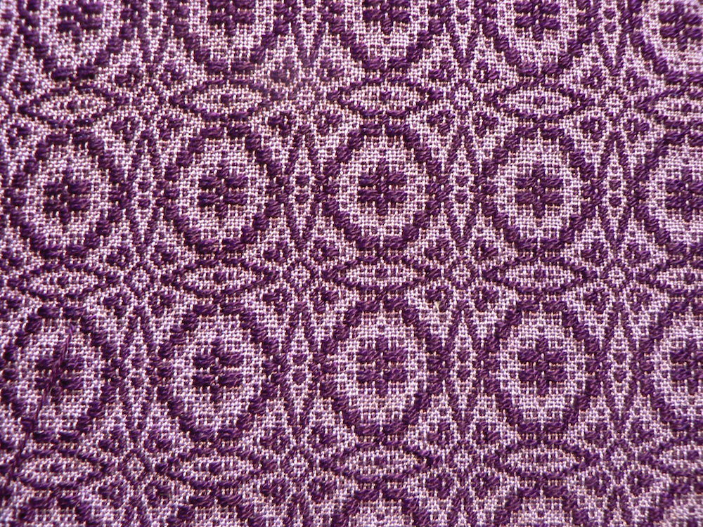
The second section also uses 10/2 cotton from Webs in the pattern, but in a lighter color that’s very close to the warp color. Here’s the front:
Here’s the back:
In the third section I tried a variegated 8/2 tencel for the pattern. I wasn’t happy with the way that the variegation interfered with the pattern, so I only wove a couple inches.
Front:
Back:
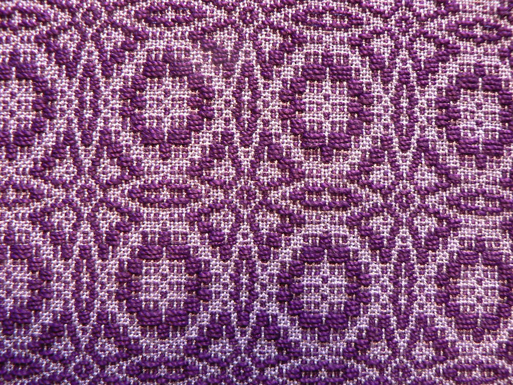
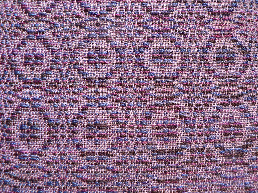
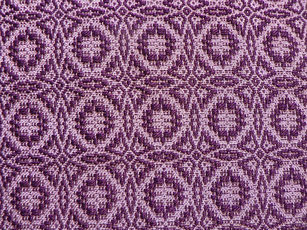
For the fourth section, I wanted greater value contrast between the pattern and tabby, but I didn’t have a darker 10/2 or 8/2 purple yarn. Instead, I wound a bobbin with two strands of 20/2 cotton together and used that for the weft. The color is Deep Purple. On the cone you can tell it’s a very dark shade of bluish purple. Against the light background it looks almost black. The weaving in this section went a little more slowly because I had to make sure the two strands of yarn passed through the shed evenly, which took a little futzing. But I really like the effect. I got the idea of doubling the warp yarn from Scott Norris of Elam’s Widow, who doubles his 40/2 linen for the pattern weft of his fabulous hand-dyed 100% linen towels.
Front of the cloth:
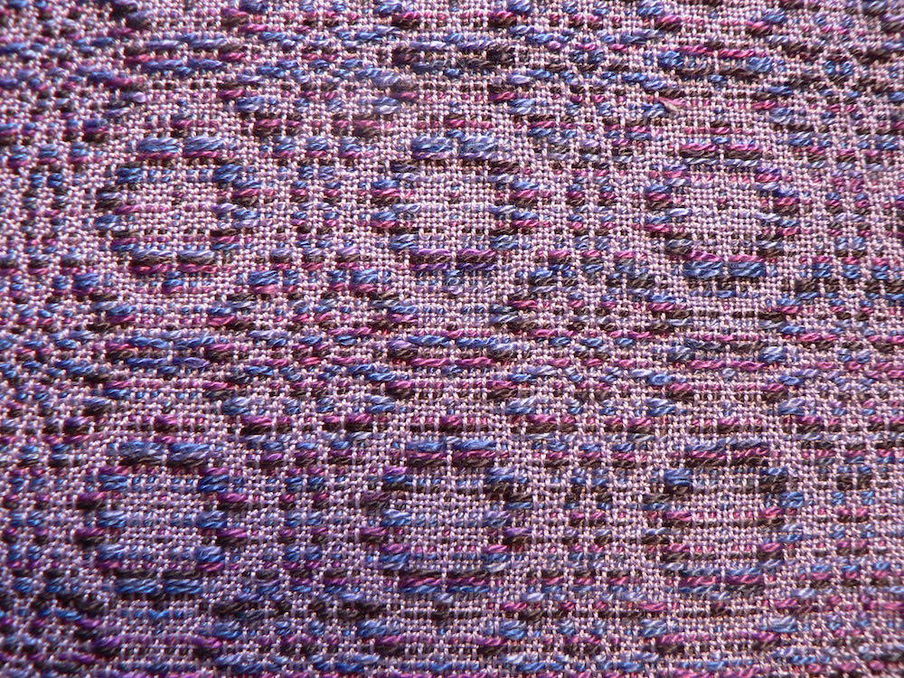
Back of the cloth:
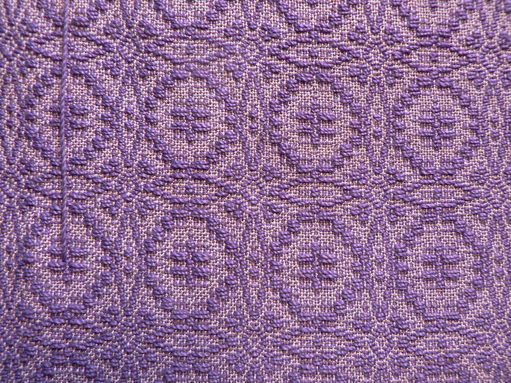
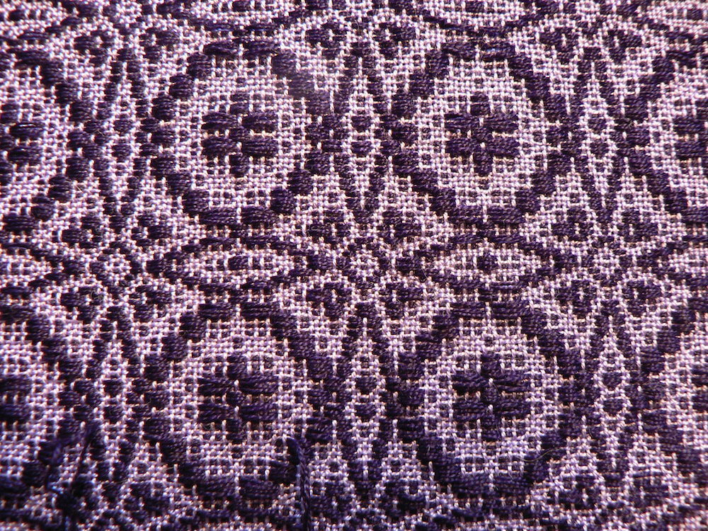
The last section is 8/2 tencel. Here’s the front:
And here’s the back:
The color of the 8/2 tencel is almost identical to the darker 10/2 cotton, but I bought it anyway because tencel has a lustrous sheen that’s hard to resist and I wondered if it would make a difference in the cloth. The difference is subtle but noticeable, though I don’t think you can see it in the photos at all.
Lastly, it is interesting to see how the different pattern colors influence the color of the tabby background. I swear that the warp and tabby are the same in every sample!
To me, the background on the right looks pinker/redder than the one on the left. I think this is because the pattern color on the right has more red in it, and the pattern color on the left has more blue. The background of the sample on the left also looks darker in value because there is less contrast than in the sample on the left.

In the photo below, the background on the right looks slightly bluer than the one on the left. The background on the right also appears slightly darker in value because there is less contrast with the pattern yarn in the sample on the right.
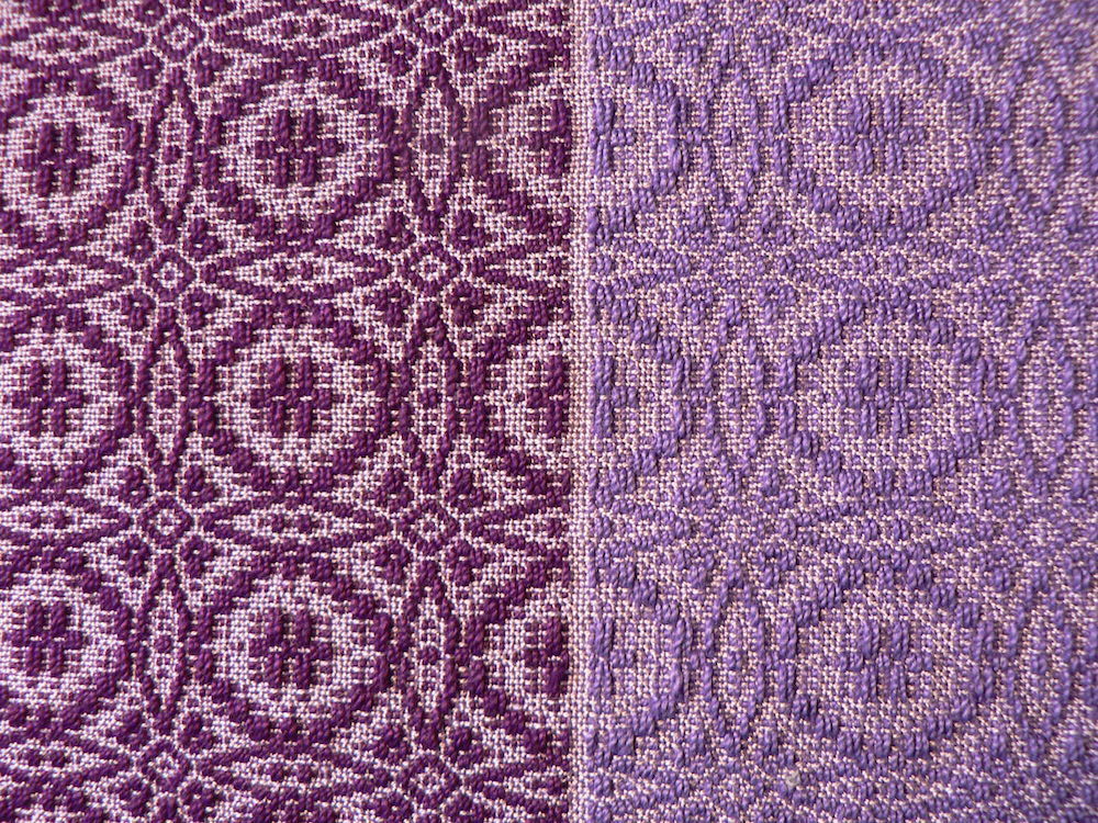
I believe these difference are examples of a phenomenon called simultaneous contrast. It’s a complicated phenomenon with a lot of different aspects. Color theory has been on my mind again lately, since Sue McFarland presented a program on simultaneous contrast at last month’s guild meeting of the Pioneer Valley Weavers. Here are a couple links (1) (2) to read up abut it if you like.
In my next pieces of cloth I am planning to use some greens and yellows for the pattern yarns, and see what happens to the purple background.