Matthew pointed out that I have been spelling Hop Vine two ways: Hopvine as one word, and Hop Vine as two words. This is because I have seen it written both ways, and personally I don’t have a strong preference. Perhaps I should be more consistent, but I don’t have good criteria for choosing between the two spellings. Without good criteria, some decisions just can’t be made. INTP anyone?
Meanwhile, here are three more pieces that I’ve woven on this warp. I re-wrote the treadling to maintain a consistent tabby order, so the pattern looks a little different from my earlier woad- and madder-dyed pieces. All the yarns in this group are commercially dyed.
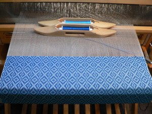
The one below has 10/2 tencel in Moroccan Blue for the pattern weft and 20/2 UKI cotton in Deep Turk for tabby:
You can see the actual color of the 20/2 yarn on the bobbin closest to the reed. You might be asking, “What happened to that bright blue?” The background of the cloth looks very light because the warp is off-white. It mutes the tabby color. As I recall from a class on color theory for weavers with Susan Loring Wells, a color plus white is called a tint.
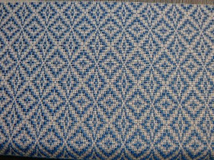
Here’s Moroccan Blue 10/2 tencel with a natural 20/2 cotton tabby:
I like this piece just fine, but the blue recedes from the white in a way that makes it seem thin and linear.
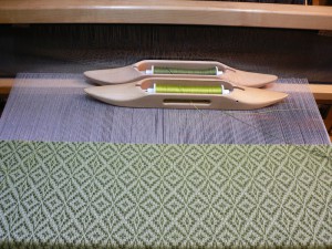
Below is a piece with olive green pattern weft in 10/2 cotton from Webs (Mosstone, I think) and 20/2 cotton from UKI (Pistachio) for the tabby:
In this case, the 20/2 bobbin is in the front, but again you can see how washed out the bright green becomes in the cloth.
All the cloth I wove with the pattern “Young Lovers Knot” had a black warp. A color plus black is called a shade. The black warp worked with the tabby colors to deepen them and make them feel more saturated. Compared to the relatively dramatic color combinations afforded by the black warp, I have to admit I am feeling a little underwhelmed with the color effects on a natural warp.
There are two interesting differences, actually, between the two warps (OK, probably more than two). Young Lovers Knot has undulating, circular motifs which contrast with visually dense square-ish blocks. This makes the design visually dynamic, whether woven star-fashion or rose-fashion. Using the star-fashion treadling, which is all I’ve tried so far, Hop Vine is very diagonal, with uninterrupted repeating diamonds all the way down. Nothing breaks up the diagonals. It is soothing and consistent, but not dramatic or dynamic.
In the two patterns, the shape of the motifs created by the pattern wefts compared to the background are visually very different, so the color combinations of warp and tabby weft do not work the same way. That is one problem, but I’m not sure it is a color problem.
The other difference, which is what I am currently stuck on, is the light versus dark warp. And that leads me to my color theory question. Can I do anything to make “tints” appear richer or more exciting? Or is there just something about adding white to a color that makes it calmer and less dramatic?
One idea I’m considering is that I could increase the contrast with the pattern weft, i.e., use a black or very dark pattern weft with a natural or very light background. This ought to make things seem more dynamic and exciting. But I think there must be more to it than that.
Since I am stuck with this warp for four or five more yards, stay tuned for some color experiments.


