Jack Frost Bookmarks

Well, as it turned out I wasn’t all that satisfied with the huck lace snowflake bookmarks. The variegation in the color made it difficult to see the pattern distinctly, and the shade of blue didn’t help either. This was ironic because I had been extremely happy with the yarn when I dyed it. It’s a nice dark blue, which is not easy to get with woad on cellulose. But it’s a bit too dark for effective lace, it seems. Not enough reflectivity, perhaps.

Here are a couple images of a snowflake motif in woad blue 40/2 linen.

woad-dyed snowflake in huck lace

woad snowflake oblique angle Continue reading “Jack Frost Bookmarks”

Woad Dyed Snowflake Bookmarks in Huck Lace

It is tricky to squeeze in weaving around teaching and my shifts at the Shelburne Arts Co-op, since weaving is a time consuming process, multi-step. I usually have to break a project into incremental tasks. That way I can do a step even if I only have a small window of time, and still feel like I am making progress.

After I wove off the Hop Vine bookcloth, I planned to weave a new batch of bookmarks. For this wintery season, I planned to weave a huck lace snowflake motif, based on a project I developed for my Master Weaver Certificate. I called the original design “No Two Snowflakes Are Exactly Alike,” because the project featured 7 different snowflake motifs. To make it work with the same threading and treadling for each, I changed the tie-up between each snowflake. This was a time-consuming way to do it, and I decided it was impractical for items that I intended to sell. So, I decided to just pick one snowflake motif for this batch. I planned to use 40/2 linen naturally dyed with woad from my garden.

For this snowflake bookmark project, a lot of the steps were already done. The yarn was dyed (though still in skeins). The designing was already done. Often times I have to do some math to figure out if I have enough yarn of a given color to make a given project. For this project, I already knew how much dyed yarn I had and roughly how much I needed, based on my calculations from the heart-motif bookmarks. Continue reading “Woad Dyed Snowflake Bookmarks in Huck Lace”

Hop Vine Color and Design

This afternoon I wove off the rest of the Hop Vine warp. I am pretty pleased with the cloth, and have even come around to liking the three sections that I was so critical of in my last post.

To add some variation to the pattern, I decided to switch to the “rose fashion” treadling for the remainder of the warp. You can see the difference in the two photos below. The first one shows the star fashion treadling. It is a series of diamonds with strong diagonals. The second is the same pattern and tabby colors woven rose fashion. Four-pointed stars alternate with ovals to create more undulation.

Mosstone and Pistachio Hop Vine Mosstone and Pistachio Hop Vine Rose Fashion

Here’s a close up of the cloth with the rose fashion treadling.

Mosstone and Pistachio close up

I do think it is more dynamic with the alternating motifs. That shift alone added a bit more energy to the cloth. Continue reading “Hop Vine Color and Design”

More Hop Vine and A Color Theory Question

Matthew pointed out that I have been spelling Hop Vine two ways: Hopvine as one word, and Hop Vine as two words. This is because I have seen it written both ways, and personally I don’t have a strong preference. Perhaps I should be more consistent, but I don’t have good criteria for choosing between the two spellings. Without good criteria, some decisions just can’t be made. INTP anyone?

Meanwhile, here are three more pieces that I’ve woven on this warp. I re-wrote the treadling to maintain a consistent tabby order, so the pattern looks a little different from my earlier woad- and madder-dyed pieces. All the yarns in this group are commercially dyed.

The one below has 10/2 tencel in Moroccan Blue for the pattern weft and 20/2 UKI cotton in Deep Turk for tabby:

blue pattern weft and blue tabby

You can see the actual color of the 20/2 yarn on the bobbin closest to the reed. You might be asking, “What happened to that bright blue?”  The background of the cloth looks very light because the warp is off-white. It mutes the tabby color. As I recall from a class on color theory for weavers with Susan Loring Wells, a color plus white is called a tint. Continue reading “More Hop Vine and A Color Theory Question”

Hopvine

My new book cloth is a variation of a miniature overshot motif called Hopvine. To create my threading I worked from two other drafts. One was “Modified Hopvine” from a sampler from the Hill Institute. The other was “Modified Hop Vine” from Marguerite Davison’s classic A Handweaver’s Pattern Book. The threading from Hill had too many ends in each pattern repeat to suit the scale of my book covers (5.5 inches by 8 inches) so I wanted to make the motif smaller. The Davison draft had fewer ends in a repeat but looked weirdly jittery in the drawdown in my weaving software.

So, I tinkered until I found a satisfying balance in the pattern, and am still tinkering with the treadling. The design consists of two different diamonds, one a longer and more pointed and the other a little more squat and rounded. I am not sure if these are supposed to evoke different elements of a hop vine, for example the leaves and the inflorescences. Or maybe the name of the pattern has a different origin. There are some nice images of hops plants here.

For those of you who recall my emboldening tabby travails of a year ago, you might be surprised to hear that I ran into the same problem of keeping a consistent tabby this time, also. Sigh. Continue reading “Hopvine”

Guild Presentation

On Wednesday November 14th I gave a presentation to the Weavers of Western Massachusetts (12/24/2023 Edited to add, they have a website now so I added a link!) about my Coptic bound books with handwoven cloth covers. It was very flattering to be invited to share my work with such an accomplished group of weavers, and I really appreciated the opportunity to talk about my process to an interested audience. It was a lot of fun. Continue reading “Guild Presentation”

Recent Books

Back in September, I finished a custom order of 8 books, which was very satisfying. I used only naturally-dyed pattern weft, in linen, cottolin, and cotton (the warp and tabby wefts were commercial). I had a variety of weld-dyed yellow, madder-dyed pink and terra-cotta, and woad-dyed blue yarns to work with. They were all woven in an overshot pattern called Young Lovers Knot, which I have been using for my book cloth for about a year now.

You may recall my frustration earlier in the spring when I was weaving the cloth, and I was bored of weaving the same pattern over and over again. I complained about it at the time, and then got re-inspired when I bought some new tabby weft colors. I also switched from weaving the design star fashion, which creates boxes and distinct diagonal lines as you weave, to weaving rose fashion, which makes the motifs rounded and gives a sense of concentric circles rippling outward. Continue reading “Recent Books”

Colonial Doubleweave

July has been a very busy time, what with all the watering (it’s been hot and dry), squishing of bugs, and weeding, not to mention flax harvesting. However, I recently did a tiny bit of weaving for my double-weave study group with the Pioneer Valley Weavers Guild, led by the elegant and brilliant Barbara Elkins.

Doubleweave is a versatile technique that lets you weave two layers of cloth at the same time. The layers can be joined at the right or left edges, joined at both edges, they can be totally separate, or they can exchange periodically (i.e., the bottom layer comes to the top and the top layer goes to the bottom). Our samples used four shafts, which is the minimum number you need.

The whole process has been full of visual surprises, beginning with winding the warp. For our samples, we wound a warp with two alternating colors. I chose black and white for maximum contrast. On the left, below, is the cross with my counting thread. You can see the separation of the white and black layers. On the right is the warp as I was beaming on. The alternating black and white ends get sorted into their respective layers when they go through the lease sticks. In the section of the warp that hasn’t yet been beamed on there is a cool transition between where they alternate and where they become separated. I warp back to front, so this un-separated section is in the front of the loom.

doubleweave warpdoubleweave cross


Continue reading “Colonial Doubleweave”

Dishtowels for Pioneer Valley Weavers’ Guild

I am a member of two local weaving guilds, Pioneer Valley Weavers’ Guild and Weavers of Western Massachusetts. The Pioneer Valley Weavers did a community service project this year where members wove dishtowels to donate to the Big Brothers Big Sisters fundraising auctions this summer and fall.

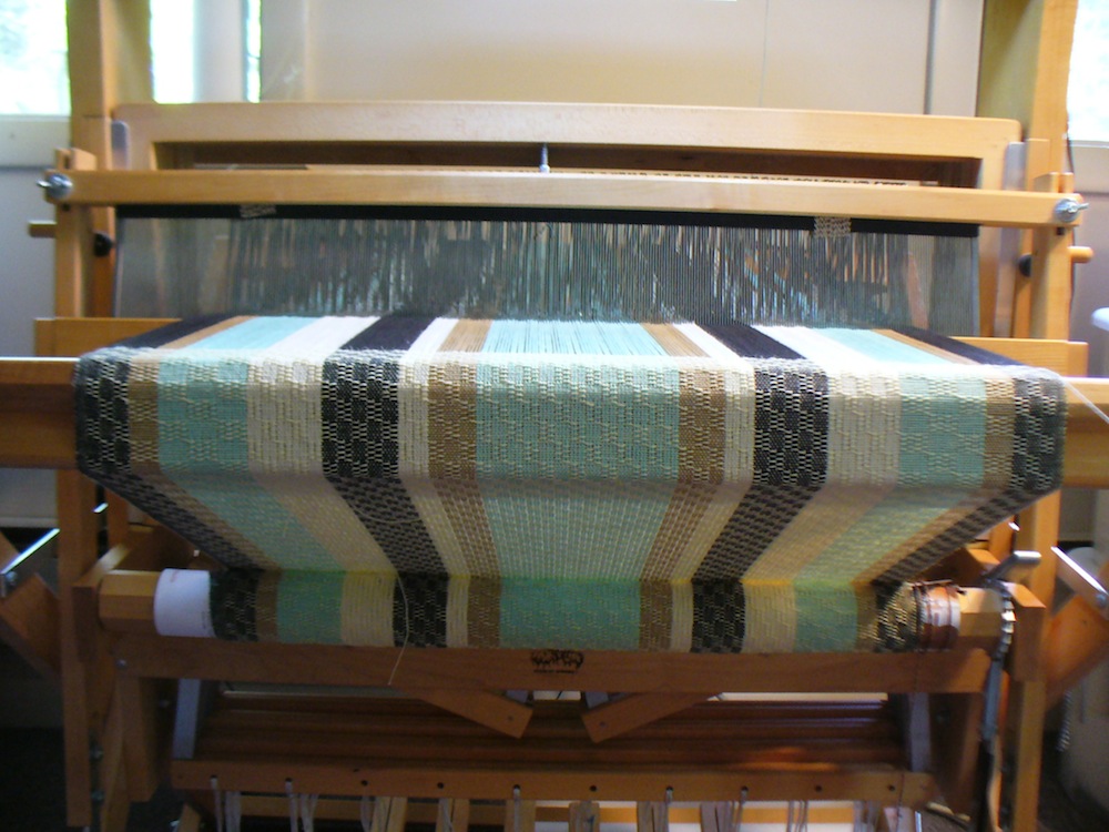
I decided to use Ms and Os for my weave structure, to get some nice bumpy texture. Here are my dishtowels in process. Here is the warp threaded, sleyed, tied on, and ready to go:

Ms and Os dishtowel warp

It is a mixture of different sizes of cotton yarns, as I was trying to use old yarns from my stash. So, the black is 6/2, the light green and gold are 10/2, and the cream is 8/2. I think they are all mercerized, but they are still soft enough to be absorbent. The width is 22.3 inches in the reed, and it’s 536 ends sett at 24 epi, sleyed 2 per dent in a 12 dent reed. I wound a 4 yard warp, which I thought would be enough for three full sized towels. As it turned out, I only had enough for two towels and one smaller napkin or bread-basket sized cloth.

One towel has a pale yellow 22/2 cottolin weft:

pale yellow cottolin weft

I like this one because the values and proportions in the stripes work the way I imagined, and I like the lacy feeling.

I wove the other towel with a bright turquoise blue 6/2 cotton weft:

turquoise blue weft

The intensity/saturation of the turquoise interferes with the stripes. As Matthew put it, everything feels like it’s underwater. In future, to use this color weft again, I would redesign the stripes in a smaller scale and with different colors. I think that a more intense bright yellow would work better than the gold, for example. On the other hand, several people to whom I showed the finished towels said they preferred the turquoise one.

For the smaller napkin-sized piece, I alternated the turquoise and pale yellow, and I like the plaid effect a lot (the pale green stripe at the bottom is plain weave, which I sewed into the hem).

turquoise and pale yellow stripes

striped napkin

Above, the napkin-sized cloth looks round because it’s draped over a round foot stool, but I think you can see the plaid effect pretty well.